BodBod
The physiotherapy app to help keep bodies happy, healthy and pain-free.
TL;DR.
Project Overview.
BodBod started as a UX Design Program project. Born out of my own personal frustrations during a global pandemic of not being able to see a physiotherapist in-person to help with my aches and pains. Due to more time spent hunched at a (poorly set up) home work station, and the inability to exercise in my usual ways - I wanted a way to motivate me to do daily stretches and exercises at home, in a safe, effective and fun way.
I believed I wouldn’t be the only one to have this experience, so I set out to uncover other people’s thoughts, feelings and needs towards what I suspected was a common problem in this “new normal” of working from home.
The result was BodBod.
Project Duration
8 months - CareerFoundry
UX Design Program Project
My Role
UX Research
UX Design
UI Design
Copywriting
Tools
Problem Space.
Most people suffer from physical pain or injury at some point in life. With our working lifestyles becoming more sedentary, it’s really important to move our bodies in a safe and effective way, in order to avoid continuous pain as we age.
There are several barriers for people seeking treatment of physical pain injury:
Cost of regularly seeing a physiotherapist (or similar practitioner)
Proximity of a physiotherapist where and when I need them
Hands-on approach has had to change (particularly since Covid-19 has prohibited physical contact with others)
Existing apps are often complicated, boring or don’t provide motivation to stick with a physiotherapy program
15 hours
the average an office worker spends sitting each day
80%
of people suffer from back pain at some point in life
$60
the average cost (NZD) of one physiotherapy consultation
Proposed Solution.
Create a mobile app that educates, motivates and reminds users to do their daily physiotherapy stretches and exercises. The app will provide physiotherapist-approved exercise routines, without users needing to visit a specialist in-person.
Key features to support users’ goals are:
Create a Profile - so Bodbod can suggest exercise routines based on users’ specific needs
Complete Exercises - help users find the exercise routines they want, and provide several ways for them to review the instructions
Set an alarm - so users can add regular reminders to do their stretches and exercises
Create a Profile
Complete Exercises
Set an Alarm
Click it.
The following describes my process of research, design and testing my app.
I conducted a full User-Centered Design process to validate my hypothesis and create solutions for my users, but if you can’t wait…
User-Centered
Design Process.
Design Process.
Keeping the user at the heart of my research and design process, meant that I could create a product that truly fulfilled the needs of my potential users. It also helped me structure my research and solutions, before testing and validating these, using prototypes with real users. This process allowed me to refine my initial ideas and iterate until the best solutions presented themselves.
-

Discovery.
Using surveys and user interviews, uncover people’s thoughts and feelings. What are their pain points, what motivates them, what are their goals?
-

Concepting.
Sketch out ideas on ‘how might we’ solve this problem/s. Are there obvious solutions, are there brand new ones?
-

Prototyping & Testing.
Bring to life the elements of the app through interactive prototypes. Test the functionality and content with users. Iterate!
Discovery.
To understand who my users might be, and discover what problems they may face in the realm of physiotherapy, I undertook a range of research methods such as competitor analysis, user surveys and user interviews.
I wanted to find out what competitors in the market were doing, what users liked or disliked about the current apps available. I also wanted to understand what barriers users faced in keeping on top of their pain, injuries and general mobility, so that I could design solutions to solve these problems.
Competitor Analysis.
Some examples of other web and mobile apps that cater to physical and mental health issues. I ran heuristic analyses and studied user reviews, to discover what people liked and dislike about these apps, as well as where there were gaps in the market that my proposed product - BodBod - could solve.
Competitor Profile.
I downloaded and reviewed many physiotherapy and fitness apps, to understand what their offering to users was.
Understanding their overall product and marketing strategies helped me position my own app, and determine the type of content users expect, and the type of business model these sorts of app are employing to monetise their product.
For the sake of brevity, here I’ll be focussing on two popular apps on Play Store:
Stretching Exercises at Home - Flexibility Training (2021)
RePhysio
Competitor Profile A
Stretching Exercises at Home - Flexibility Training
Competitor Profile B
RePhysio
SWOT Analysis.
I also examined the Strengths, Weaknesses, Opportunities and Threats of my competitor apps.
This helped me work out what I needed to include in my app to make it even more useful to users, and ways to fill any gaps in the market (whether that was content, functionality, usability etc).
SWOT Analysis A
Stretching Exercises at Home - Flexibility Training
SWOT Analysis B
RePhysio
Key Findings.
Physiotherapy apps often exclude an onboarding process, and require users to sign-up or subscribe prior to exploring what the app has to offer. Increases drop-off rate of users.
Voice-over instructions on exercise videos often sound robotic and uninspiring/impersonal
Logical categorisation of exercises helps users sort through a vast number of exercise videos more easily
Third-party video content creates a messy and inconsistent brand experience
Resource rather than companion. These apps are often a good source to find physiotherapy exercises, but don’t remind or motivate users to keep coming back
User Surveys.
To get some quick quantitative and qualitative data about my potential users, I created a User Survey (via Google Forms) and sent to friends, family, and my wider professional network that broadly matched the participant characteristics I had defined.
This method allowed me to get some bulk information, to help me understand general demographics of potential users, whether or not they had used an app in the past to help with physical pain management, and other basic questions.
Survey Results.*
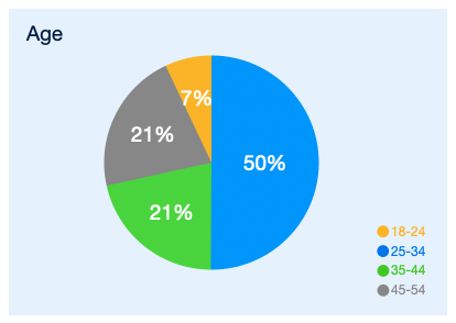
Target audience looks like females, aged 25-54
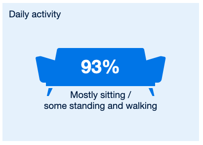
Most likely sedentary jobs/lifestyle
Prefers low-impact activities to look after their bodies such as walking, yoga and cycling
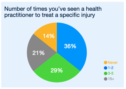
Have suffered from pain/injury in the past and most likely received professional treatment
Stop treatment because it’s too expensive, inconvenient or no longer require it for immediate pain
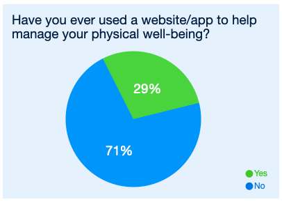
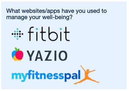
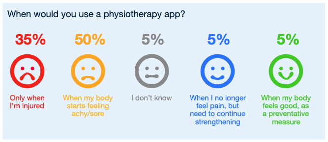
Haven’t really used an app to manage pain, but would most likely use it when they’re injured, or on the brink of pain
*Results based on 14 responses.








User Interviews.
After initial findings from the User Surveys, I wanted to dig deeper to understand my audience's thoughts, needs, and motivations towards recovering from injuries.
Additionally, I wanted to understand their habits and perceptions of existing app-based solutions on the market.
I ran User Interviews (in person and via Zoom) so that I could uncover the “WHY” behind particular user behaviours, thoughts and needs.
Interview Results.*
Most people who have dealt with pain or injury wait for a significant amount of time before seeing a professional (approx. 2 months)
People need some form of accountability in order to stick with a physio program
Biggest barriers to sticking with a physio program are: boredom, no motivation, lack of accountability, forgetting when and how to do the exercises, expense of seeing a professional
Of those who have used fitness apps in the past, the ability to track their progress is really important - along with some type of competition (either with themselves or others)
Should steer clear of diagnosing a user’s pain/injury. App should provide information but be careful about the type of advice it provides.
*Findings based on 5 interviews.
Survey & Interview Synthesis.
After conducting User Surveys and Interviews, I collated all the data and quotes and began mapping out the key: behaviours, attitudes, needs, goals and frustrations of users who have suffered physical pain and injuries in the past. I was particularly interested to understand what did or didn’t help them on their road to recovery, and what might help make a physiotherapy program more enjoyable.
Affinity Mapping.
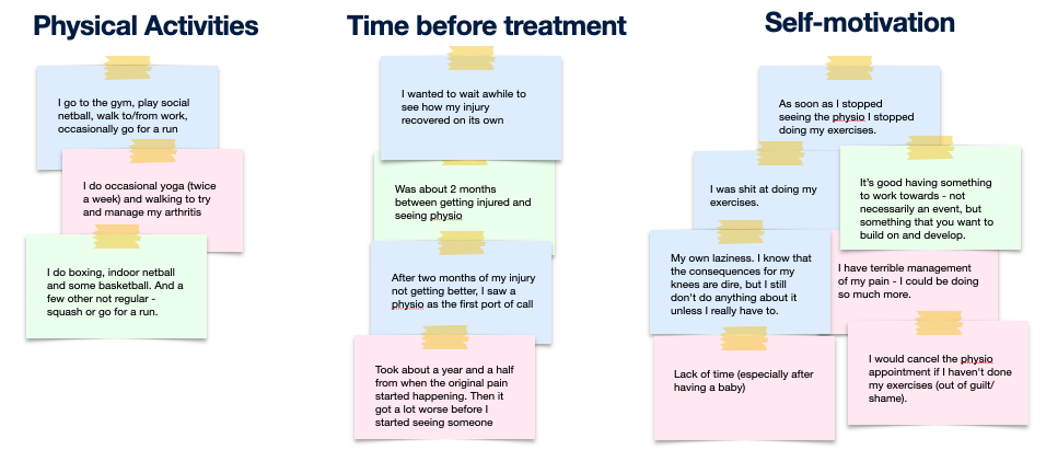
To make sense of my data, I used Affinity Mapping as a way to cluster my findings.
Themes began to appear regarding what users struggled with when it came to managing their physical health, as well as pain-points of existing apps who tackled this issue.
This gave me better direction on what features to focus on, and was a starting point before I began sketching out any solutions.


Key Learnings.
Accountability: users need someone or something to stay accountable to, in order for them to continue with a physiotherapy program
Community: having the camaraderie of friends - and an element of competitiveness - makes exercising more fun
Reminders: users need a reminder to continue doing exercises on their own.
Professional Help: users don’t trust they’ll do their physiotherapy exercises correctly once they’ve left the specialist’s office
Progression: it’s important for users to see improvement/results in order to be motivated to continue their exercise program
User Personas.
Out of the user research and analysis, three different user personas appeared.
Each persona has distinct needs, behaviours, pain-points (literally and figuratively) and motivations for engaging with an app like BodBod.
Hazel, Claire and Sam represent the very different user profiles that BodBod needed to cater for.
-

Hazel
THE FUTURE-PROOFER
The user who wants to improve her posture, stave off aches-and-pains, and make sure her body stays flexible and supple as she gets older.
-

Claire
THE PAIN-MANAGER
The user who suffers from a genetic condition (such as arthritis) who wants to manage her pain better through gentle, regular stretching and exercise.
-

Sam
THE REHAB-ER
The user who’s active and occasionally has a sporting injury. He’s good at doing his physio rehabilitation, but finds it boring and wants a way to make it more fun.
Now that I had an understanding of who my users might be and the issues they might face when trying to manage their physical well-being, I was able to construct and overarching problem statement; a problem in which my app would seek to solve.
Problem Statement.
“Health-conscious users need a way to consistently treat or prevent injuries safely in their own space and time because they don’t always have access to a physiotherapist to tell them when and how to perform their exercises.”
User Journeys.
To understand the user’s thought process - and to help design genuinely useful features and functions - user journeys were mapped out for the three personas.
This helped set the scene for when the BodBod app might be used, and identified ways to help users achieve their goals.
User Journey 1 - Add a reminder alarm
User Journey 2 - Share progress with others
User Journey 3 - View challenge leaderboard
User Stories.
These were developed based on real-life conversations with users, as well as from identifying gaps or problems with competitor products.
“As a patient, I want to build an exercise program based on my specific areas of pain, so that I can treat it safely and appropriately at home.”
Functional Requirement:
Function to build a bespoke exercise routine, dependent on personal conditions/needs.
“As a user, I want a place where I can find my favourited stretches and exercises, so I can access these easily.”
Functional Requirement:
Function to favourite an exercise video or program.
“As a forgetful person, I want a way to be reminded to do my stretches and exercises regularly, so I actually make progress.”
Functional Requirement:
A way for users to create reminder alarms, depending on their needs and preferences.
Concepting.
Now that I knew who my users were and had some ideas about the type of solutions an app like BodBod should contain, it was time to start sketching out ideas and visualising the features and functions of this app.
Task Flows.
From these user journeys, I was able to map out some key task flows for each persona, to ensure user goals were achieved and expectations of the BodBod app were met.
This helped identify gaps in the app’s functionality, and made sure all steps of a task were accounted for.
Example Task Flows for each persona.
User Flows.
Visually describing how a user would/could approach a task, helped plot out certain features and functions a task flow may need, in order for users to achieve their goal. It also helped identify where certain steps could be consolidated or simplified, to enhance the user experience.
Task Flow 1: Set a Reminder Alarm
Task Flow 2: Save Exercise Program
Task Flow 3: Advance to Next Level
Information Architecture.
I roughly planned out the site architecture for my app - as a starting point.
To help build and refine the site map for BodBod, a hybrid card-sorting exercise was conducted through Optimal Workshop.
Analysis of the results (using a Standardisation Grid, Similarity Matrix and 3D Cluster View) helped identify trends in categorisation which in turn, informed how the site map was refined.
The refined site map was the basis for future wireframes and prototypes.
Initial Site Map.
Card Sorting Analysis.
I created a hybrid card-sort through Optimal Workshop, to understand how people would group content into existing categories. Participants could also create their own categories to sort cards into. I used several methods of analysis to pull insights from the data:
Standardisation Grid.
The participants grouped several of the cards into exactly the same categories. Some were quite expected (e.g. Account Detail, Change Password, Manage Subscription all went under ‘Profile’).
Other cards were scattered over all the categories, which makes me think that the labels of the cards weren’t clear enough - or there wasn’t a logical category for it to sit under.
These cards (e.g.Health Profile, Search, and Injury Details) will need some thought in how they are labelled or categorised. Interestingly, some other categories were grouped the same by participants, but under different headings than what I expected (e.g. Symptoms got put into ‘Health Insights’ by all participants).
Similarity Matrix.
The Similarity Matrix gives a good view into those cards that were grouped together, or spread out over many categories. Again, unsurprisingly, the “Settings”-type cards were almost 100% grouped together by all participants.
The particularly vague cards that were difficult to categorise include Search, Workout Tips & Tricks, Injury Details, Health Tracker and My Goals. It could be that these cards are either expected to appear on all pages, or that they need to be re-labelled in order to find/categorise easier.
It might be, for instance, that the “Search” function has a fixed position on all pages.
3D Cluster View.
This view of how participants have grouped the cards is helpful, so that I can review and potentially rename the original category names, and/or re-group the cards as per how participants have responded.
This analysis shows which cards were most often grouped together and with which category label. For example (in Group 2) 75% of participants included the listed cards under “My Training”. However, those cards also appeared under “Clock” and “Stats”.
Which makes me think, perhaps the “Clock” page (and it’s associated functions) should sit under “My Training”, as opposed to a top level page on the dashboard.
Site Map BEFORE Card Sorting
Site Map AFTER Card Sorting
Key Findings.
Next time I would do an open card sort (as opposed to hybrid), to see how users would naturally group things without my intervention/suggestion of category names.
The more “administrative” cards (e.g. change password, account details, manage subscription) were categorised almost identically by participants - so I will group those together (under “Profile”), as this seems most logical for users.
There were several cards which participants all categorised differently. I will need to address how these are labelled, if they should be grouped differently altogether, or moved under another category heading - in order for users to be able to find this information easily.
Wireframing.
I created wireframes and prototypes for all of my key features; taking them from low-fidelity sketches, all the way trough to high-fidelity interactive prototypes.
This helped me visualise the user flows I had mapped out and added clarity and detail to my solutions. It also helped me plot out content and typographic hierarchy to make the feature more useful and intuitive for users.
Below shows the progression of one key feature “Browse Exercises”, through each step of the wireframing process.
Feature:
Find an Exercise Routine
This feature had the largest number of iterations, as there were many parts to make this deliver value for our users. From the search bar and filter functions, through to how search results were displayed and ultimately how the exercises themselves were formatted.
Some of the most impactful changes to this flow were:
Identifying how much metadata was necessary to give users context
Validating which layout communicated best with my users
Adding clarity and simplifying my user journeys
Low Fidelity.
Before spending time designing in a program like Adobe Xd or Figma, I wanted to quickly and roughly sketch out the basic elements needed for my users to complete their goals for each feature.
The feature of “Find an Exercise Program” takes the user from the Home Screen where they can browse exercise programs that have been suggested by BodBod and grouped into particular categories. I also wanted users to be able to search for - or filter - exercises, based on their specific needs.
This flow takes users from the beginning of the search, through to viewing and favouriting an exercise program.
Mid Fidelity.
Adding more detail to my designs allowed me to think deeper about how my users would interact with each element on the screen. I also began to refine the user experience of each step of my key user journeys.
After sketching out my screens using pen and paper, I translated these digitally so I could start adding more detail and refining the layout.
Most of the text was placeholder, aside from a few headings.
I created icons for the global navigation bar, specifying each of the key features of this app.
High Fidelity.
I increased the fidelity of my designs by adding UI elements, descriptive copy and imagery (most importantly photographs for the exercise video thumbnails). This helps users better understand the content and context of each screen.
Higher functionality was also added, so users could step through each stage they needed to, in order to browse through exercises, and ultimately add an exercise program to the “My Training” page.
I was now ready to test this interactive prototype with users, to get feedback to iterate and improve the usability and functionality of this app.
Prototyping & User Testing.
After researching, defining, and visually designing my feature flows, I created interactive prototypes in Adobe XD. It was important to test how effective the prototype was at solving the customer problems identified during the research phase.
Using both in-person and remote moderated methodologies, I gained crucial insights into what was and wasn’t working with the key user journeys of this app.
From initial test plan to improved design, the following shows iterative process and learnings from my usability tests.
Plan Plan Plan.
A test plan was prepared prior to conducting usability tests in order to identify test goals, objectives and describe the methodology and participants involved.
Testing Plan.
-
Goal.
To assess the learnability for new users of this physiotherapy app on mobile and desktop. I want to observe how users interact with the app, to understand how easy it is for them to navigate around the site and complete initial functions (such as creating a profile, setting a reminder alarm and finding a relevant exercise program).
-
Scope.
Test 4 x user flows for the physiotherapy app, BodBod by asking participants to complete the following tasks:
Task 1: Create a profile
Task 2: Search for exercise programme
Task 3: Save an exercise programme
Task 4: Add a reminder alarm
Each task will be posed to the participants as a “scenario” to add context to what they’re required to do. Follow-up questions during and after each task will also be asked.
-
Participants.
There will be 6 participants (sourced from personal network of friends, family and CareerFoundry students). To ensure they fit with the user persona of BodBod, they are screened to have an interest in physiotherapy or physical wellbeing. Here is a list of participants and basic demographic information
Usability Test Data.
Six usability tests were conducted remotely and in-person to assess the Mobile version of the BodBod app. Observations were recorded on post-it notes in Miro.
Quotes and Observations from Usability Tests
Affinity Mapping.
To uncover usable insights, comments and observations from each task of the user testing were clustered into common themes, to help identify usability issues and errors (as well as capturing what participants did like about the app).
Pain-point Prioritisation.
Key themes from the Affinity Mapping session were then collated into a Rainbow Spreadsheet. Participants were colour-coded and identified as P1 - P6 (with a corresponding coloured box being added every time a participant identified with one of the key themes).
This helped determine the severity and frequency of any issues and errors.
Key Findings.
Five main issues presented themselves out of our Rainbow Spreadsheet Analysis:
Issue 1: Users found the categorisation of exercise videos on the Home Page confusing and didn’t know what they were related to
Issue 2: Users didn’t have enough information about what the videos contained
Issue 3: Users found the global navigation icons hard to see
Issue 4: Users didn’t know where to find Favourited or Saved videos
Issue 5: The question around “Genetic Condition” in the “create profile” section didn’t sit well with users
Design Evolution.
Based on the insights gained during Usability Testing, I iterated on my screen designs to address the issues discovered. After solving all the identified issues, I also added more UI detail to my views at this stage.
Issue 1.
Users found the categorisation of exercise videos on the Home Page confusing and weren’t sure what they were looking at.
Solution.
Make the category names more descriptive (and less specific).
The “Recommended for you" videos will be informed by details users provide in both onboarding and “create a routine” data
Add category tagging and metadata to video thumbnails, so users had more detail about what that video contained
Increase the size of video thumbnails, so imagery and text are easier to read
Issue 2.
Users didn’t have enough information about what the videos contained.
Solution.
Add metadata to the videos (including video duration, how long ago the video was uploaded etc)
Add category tagging to these videos, so users can easily filter by need
Add text and illustrative instructions, so users can see what the video contains at a glance, without having to watch the whole thing. This also allows users to complete the exercises without sound on.
Issue 3.
Users found the global navigation icons hard to see.
Solution.
Increase the contrast between the icons and the background.
Issue 4.
Users didn’t know where to find “favourited” videos.
Solution.
Add a pop-up box when users clicked on the “favourite” heart icon, advising them where they could find these videos again
Show this every time the heart is clicked - so users don’t have to remember - reducing cognitive load
UI Iterations.
I used Gestalt Laws of Grouping and Principles of Design to improve the User Interface of BodBod. Using these common techniques helped make the layout and aesthetic more balanced, pleasing and familiar to users.
Home Page.
The Home Page allows users to create their own exercise/stretching routine and recommends other routines based on user preferences. I used Principles of Design to identify which items on this page were most important for users to focus on first.
#1 Proportion
I divided the “above the fold“ portion of this screen into a 2:1 proportion, to break the monotony and use a proven visual design ratio. Harmony is created in the design by dividing the screen into proportional sections and dividing the content within, into proportional sizes of elements.
#2 Hierarchy
“Create a routine” is a key feature of the app, so I wanted this to stand out more and for users to explore this first.
In order to do this, I reduced the font size of the workout categories, along with the size of the search bar and filter icon. This also allowed for more categories to appear on the screen at once.
Exercise Videos.
This screen is where users come to view their exercise program. There are both video and illustrative/ text-based instructions. I wanted to help users understand that the step-by-step instructions are related to the exercise video above.
#3 Hierarchy
Reducing the font size of “Step-by-step instructions” makes this less important than the main video (which is the hero item on this screen).
#4 Law of Proximity
Moving the instruction text, image and drop-down arrows closer together, helps users know that those items are related to each other. In the “before” version, there could be confusion that the info contained in the blue rounded-rectangles might be separate things.
#5 Law of Good Form
Keeping the text/illustrative instructions within the same coloured box as the video, helps users understand that these are part of the same program.
Create Alarm.
Users are able to set a reminder alarm on this page, and can change details such as time, day, sound, vibration and snooze functions. I used Principles of Design to make the functions on this page more obvious for users.
#6 Emphasis A
To make it easier for users to see at a glance what days they have selected for this alarm, I made these stand out better in a blue circle with white text.
#7 Emphasis B
Because many of the elements on this page are blue (and users can scroll to see more details) I wanted the CTA of “Save” to stand out better. So I made this green (which also has connotations of “go” and “proceed” which makes sense for a saving action.
Final Interactive Prototype.
After 8 months of blood, sweat and (not too many) tears, I arrived at my final interactive prototype. This reflects all the research, ideation and design innovations that have been put into this project - with the help of many willing friends, family, UX community and enthusiastic strangers, who participated in my user surveys, interviews, and testing.
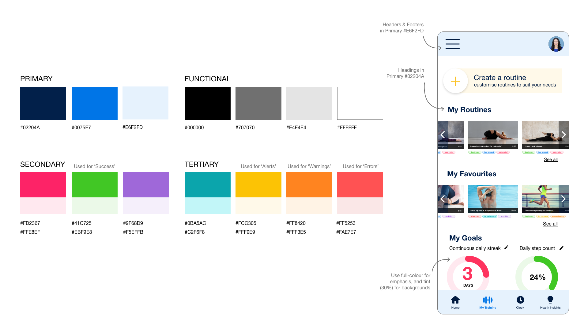
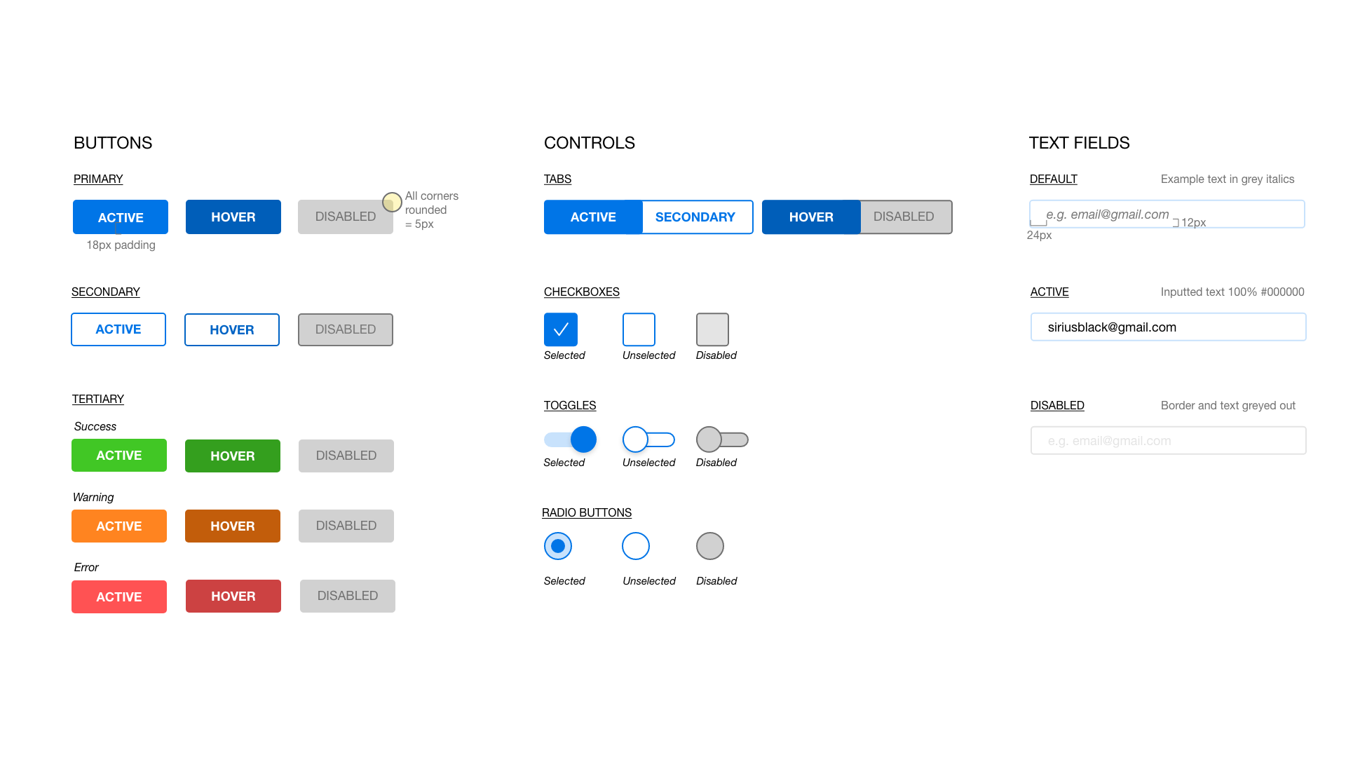
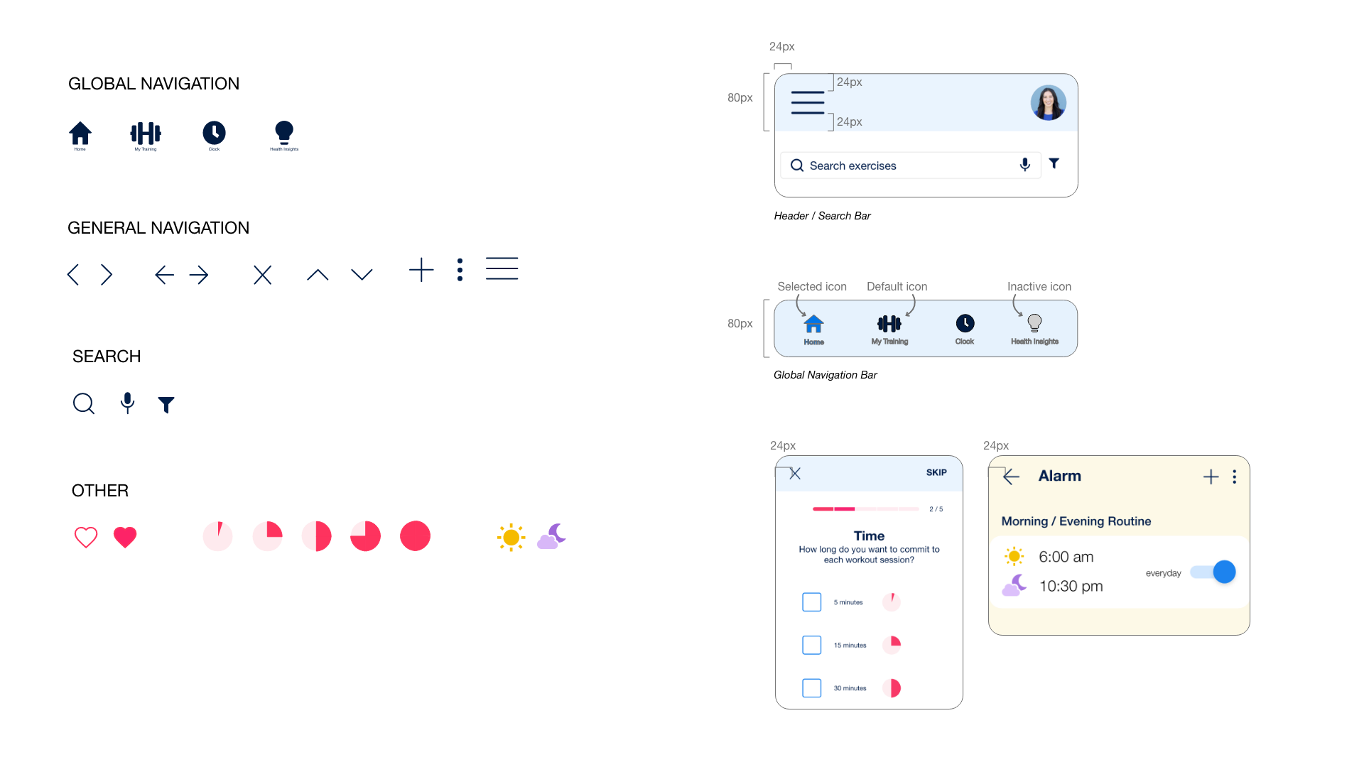
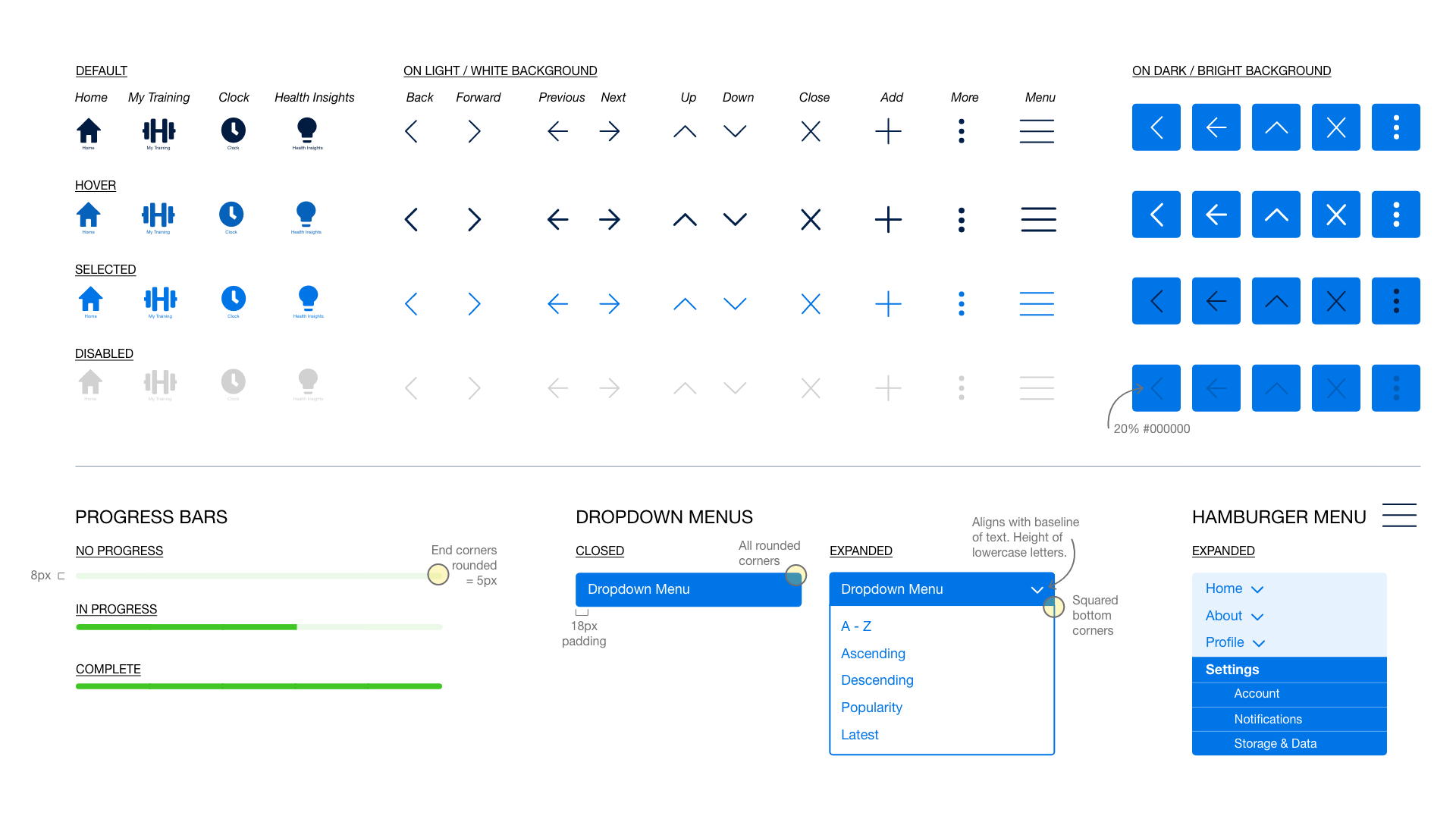
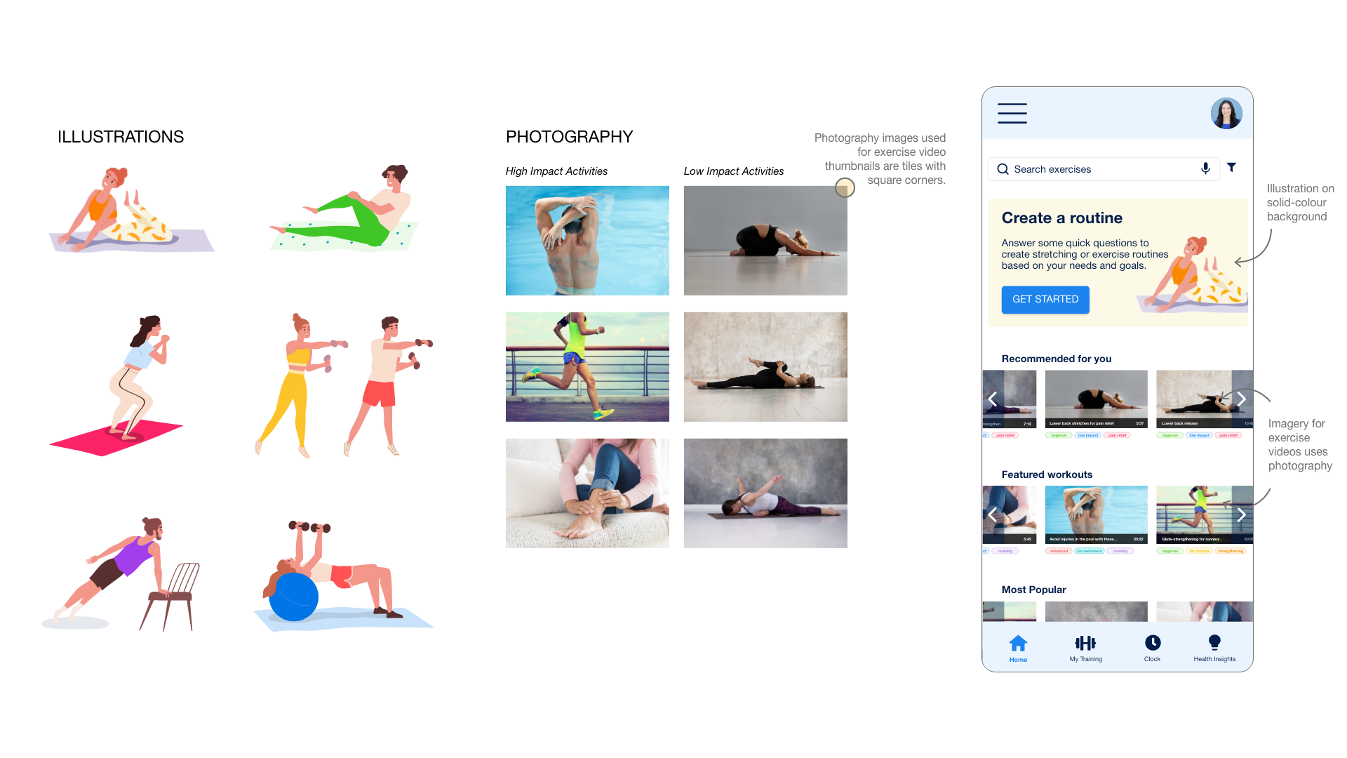
Style Guide.
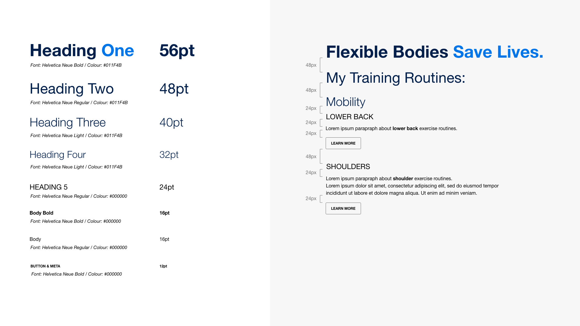
To create visual consistency across all BodBod screens, I developed a design style guide and design language. This included guidance for:
Typography
Colour
Iconography
UI Elements
Illustration & Imagery
Tone-of-voice

Retrospective.
What Went Well.
I learned a lot with this project. Some of the highlights were:
The Discovery phase of this project. I really enjoyed the user interview process - hearing different perspectives of my users. As well as exploring competitor apps to uncover what I could pinch or avoid from their products.
Iterating on my designs after usability testing. Every single time, my app improved due to the feedback of users, which was really encouraging and fun to see how it developed.
Discovering that there is a need for an app like BodBod and there are a range of different needs or use-cases that could be solved through one product.
Users appreciated real-life functionality when testing the interactive prototypes (e.g. horizontal scrolling of images, vertical scrolling of changing an alarm time)
Users were delighted with some of the interactive questions in the “Create Profile” questionnaire (such as clicking on the body part that they have pain in, rather than finding it in a checklist or having to type it)
Every round of User Testing gleaned truly helpful insights in improving the functionality and usability of BodBod
Improvements for
Next Time.
Next Time.
As always, there were learnings from this project that I could keep in mind for next time:
User Interviews and Moderated Usability Testing took longer than I thought. Allow around 40mins (rather than my ambitious 15mins…) to ensure there’s plenty of time to ask or answer any questions, and get the most out of my time with the user.
Run Usability Testing on higher fidelity prototype. While the greyscale version was ok, having more functionality (such as metadata on videos, or more descriptive text) would have made the experience easier for the user, and uncovered other issues other than basic functionality
Global Navigation Icons should always have high contrast with the background - even if they’re not in use. Anything too similar will look disabled and confuse users.
Increase the baseline size of my copy from the outset. Anything smaller than 16 pixels is difficult for many users.
Thanks for coming on this journey!
To learn more about this project or to discuss how I could help with yours - please get in touch, I’d love to chat :)


