Tātākī
Project Overview
Tātākī is a mobile app designed to empower users to learn new te reo Māori vocabulary. Users can discover and practice new words at their own pace, so they can incorporate te reo into everyday conversations.
Tātākī
1. (verb) to be talkative, witty, loquacious, chatty, mouthy.
Objective.
To design a vocabulary app to help older users learn te reo Māori (the native language of New Zealand). I found that there were not (m)any local apps that taught te reo in a fun, engaging, game-like format. They are mostly educational, quite dry, and don’t motivate users to continuously interact with the app.
Problem Space.
After many generations of New Zealanders only knowing basic Māori vocabulary, the integration of te reo is becoming much more common in New Zealand media, business practices and the community. It is important that people feel confident in learning and using te reo in their everyday conversations, in order for this to become mainstream.
Hypothesis.
“By creating an app that uses gamification to engage and encourage users to consistently learn new Māori vocabulary, this will help make te reo Māori more mainstream in everyday conversation.”
Purpose.
Tātākī was a personal project I designed as part of my UX Design Program at CareerFoundry, to demonstrate my knowledge and application of the User Centered Design Process to create a responsive mobile app.
Duration.
2 months.
My Role.
UX Researcher
UX Design
UI Design
Usability Testing
Skills.
User Interviews
Competitor Analysis
User Personas & Stories
Information Architecture
Wireframing
Usability Testing
Tools.
User-Centered
Design Process.
Design Process.
To keep the user at the heart of my research, analysis and design, I used the User Centered Design Process to structure my approach.
The following sections are defined by each step of the UCD process:
Discover
Conceptualise
Prototype & Testing
Discovery.
In this phase, I wanted to know not only who my users might be, but the struggles or motivating factors behind them learning a second language.
I wanted to understand the different ways my users learn and retain information, in order to create an effective tool for a range of different learning styles. Taking inspiration (and recognising the shortfalls) of both competitor apps and in-classroom learning, would help me create a fun, motivating and useful product that users would want to engage with again and again.
Competitor Analysis.
To understand what other offerings were out there for users to learn languages, I undertook an analysis of competitor apps. I wanted to know what type of functionality and content a user might expect from a language-learning app in general, what apps made learning more fun and engaging, and how existing te reo Māori apps stood up against some of the more popular apps. This helped me identify gaps in the market, along with taking inspiration from features that worked really well.
The focus here is on the analysis of key features:
Sign-up process
Onboarding
Navigation & layout
Usability
Key findings.
Delaying the sign-in process removes friction of use and commits users to the app
Progress bars encourage users to complete a lesson
Gamification helps users form a habit and is a fun experience
Do not use loss of “lives” to punish failure
Availability of podcasts is a nice way for people to learn about a language and culture
Breaking lessons into different styles of learning (e.g. by listening/ flashcards/ writing) helps the app be accessible to a range of different users
For generic or “shared” topics such as pronouns and numbers, these should be accessible on the home page or as part of their own sections (not broken up into lessons)
Having audio pronunciation alongside English/Māori translation helps embed the info in users minds
User Interviews.
Before going any further, I wanted to learn if this product would be of interest to people, and if so, what their motivations would be to use it. I undertook a series of in-person user interviews with people who had learned a second language in the past (both te reo Māori and others), to uncover how they learned best, what their frustrations were in learning or retaining vocabulary, and what they would want from an app to support their learning journey.
Interview Quotes.
-
“I learn language better with other people - it isn’t as interesting on an app/computer - it’s better when it’s face to face”
-
“I think with learning you’re often given information, but you haven’t learnt it. It’s important to be understanding and processing as you go along.”
-
“I feel frustrated that my lack of knowledge around English grammar made learning a new language more difficult”
-
“I thought I would do learning on my own this year outside of going to a class - but I haven’t. I needed motivation from being part of a course”
-
“I feel obligated to walk the talk in order to encourage others to learn te reo Māori: I need to be able to say a few phrases correctly and appropriately.”
-
“I think if I had been in immersed in a language e.g. living in Germany/France or spent more time on a Marae (Māori meeting place), learning/retaining a language would come more easily.”
-
“I feel motivated to continue learning a language when I’m with other people and a teacher has set us assignments to complete in a designated amount of time”
-
“I always play brain-training games on my devices - apps with memory and cognitive exercises”
Key findings.
Having accountability of friends or other people, helps users create habits around learning a new language
There are many different learning styles, so the app should accommodate this, in order to be inclusive to a broad range of users
There needs to be context to when and why you might learn a particular word or phrase, to help embed the vocabulary and give users confidence on how to use it
Having short time constraints encourages users to complete tasks, rather than an open-ended amount of time to finish something
Turning learning a language into a game, helps users retain information and encourages them to continue interacting with the app
Providing support on native language rules can help users understand how this relates to a new language (e.g. educate users on what verbs, tense, adjectives etc are).
User Personas.
Having a specific persona in mind kept me on-track when I was designing features and functions of this app. From my User Interviews, I developed the persona “Jill”.
“As an ex-pat living in New Zealand, it’s culturally appropriate that I understand and respect the native language of this country I call home”
Persona Profile.
Needs & Goals.
Wants to practice pronouncing Māori vocab with others in an informal setting
Wants to incorporate more Māori vocab into everyday conversation with friends
Needs vocab to be repeated often for it to be retained
Needs to visually see a word (both written out and as an image) in order for it to make sense
Challenges.
She no longer has the memory she used to have, so needs new ways to help her retain what she’s learnt
She lacks motivation on her own, and finds that she needs the encouragement and accountability of learning with others
Motivations.
Respect for the country she has adopted for 30+ years
She wants to get the most out of news articles and local documentaries, where the use of te reo Maori is becoming more mainstream
Learning a new language helps keep the brain active
User Stories.
Crafting user stories was a way to identify problems or expectations of users, so I could design relevant features to solve or support user goals.
-
“As an older person who’s memory is not as good as it used to be, I want lots of repetition of the vocabulary I am learning, so that I can retain it easier”
-
“As an ex-pat, I want help with Māori pronunciation, so that I feel confident and comfortable speaking te reo Māori in front of other people”
-
“As a social retiree, I want to stay connected with real people, so that I feel part of a community”
-
“As a visual learner, I want to see the words written alongside other visual cues, so that I can picture the word when it comes to speaking it out loud”
-
“As a native English speaker, I want help with English grammar and language rules, so that I can better understand these concepts when it applies to learning another language”
-
“As someone who enjoys game apps and quizzes, I want to learn a language in the same fun kind of way, so that it motivates me to come back to learn more”
Problem Statement.
“Users need a fun way to learn and practice te reo Māori, because it’s important for people living in New Zealand to be able to use the native language of this country. We know this will be true when we see users applying Māori vocabulary to their everyday communications with friends and family.”
Concepting.
Now that I understood who my users were likely to be, and the challenges and motivations they faced when learning te reo Māori, I was able to start mocking up some screens for my app, Tātākī.
Task Flows.
Based on my User Stories, I started writing Task Flows that would map out what a user would need to do, in order to achieve their goals. This could be anything from a sign-up process to sharing achievements with friends. Here, I’ll focus on two key features of Tātākī, which help users add/store new vocabulary in the app, and review previously learned words.
Task Anaylsis 1.
“As an active individual, I want to learn vocab that relates to my interests, so that I can easily start incorporating this into my everyday conversations”
USER GOAL: Add a new vocabulary word
ENTRY POINT: Open App
Sign in to account
Go to Home Page
Click on “+” icon to add new words for translation
Search for word using the search bar
View translations from a list of definitions
Choose translation by clicking on “add word”
Add word to an existing category OR “create new category”
Type in name of new category
Add word to category
SUCCESS CRITERIA: Word added to new or existing category
Task Analysis 2.
“As an older person who’s memory is not as good as it used to be, I want lots of repetition of the vocabulary I am learning, so that I can retain it easier”
USER GOAL: Review and reinforce my previously learned vocabulary
ENTRY POINT: Open App
Sign in to account
Go to Home Page
Click on “My Words” icon to review previously added/learned vocabulary
Select topic from list of existing categories OR choose “shuffle” to be tested at random
Select “Start Quiz”
Answer quiz questions
Submit quiz answers
View quiz results
SUCCESS CRITERIA: Completed a vocabulary quiz
User Flows.
I translated the Task Flows into User Flows - to ensure I found any glitches along the “happy path” of completing a task. What would happen if users misspelled a word, or had already added it to their learning list? What happens if a user gets a question wrong or accidentally exits a quiz?
Again, the User Flows I’ll focus on here, relate to the Task Flows above. You can see where a user might deviate from the “easiest” path to success, and how I’ve added in steps to guide users back on track.
User Flow 1
User Flow 2
Wireframes.
With User Flows in place, I could now start sketching out screens to align with each step in the flow. To start with, I made quick paper mock-ups, before digitising these in Sketch.
Low-fidelity
Rough ideas were sketched out using pen and paper, to start arranging key elements for each of my screens. I wanted to see how each screen would interact with each other, and the type of functionality a user might need in order to get from opening the app, to reaching their goal.
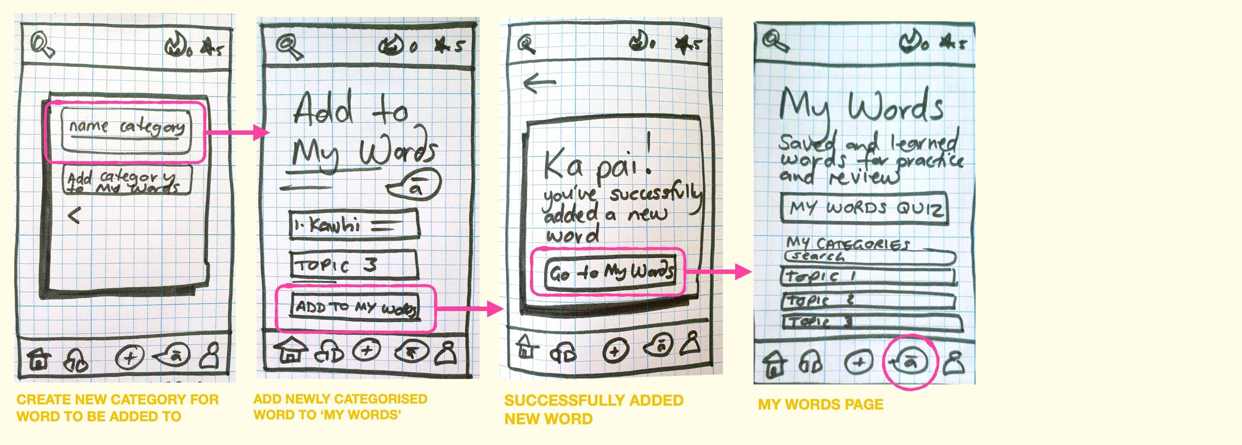
“Add a new word”.
Starting at the onboarding screen as users opened the app, these paper mock-ups explore how a user might add a new word to their personal dictionary, and save it to a new or existing category so they can find it again later.
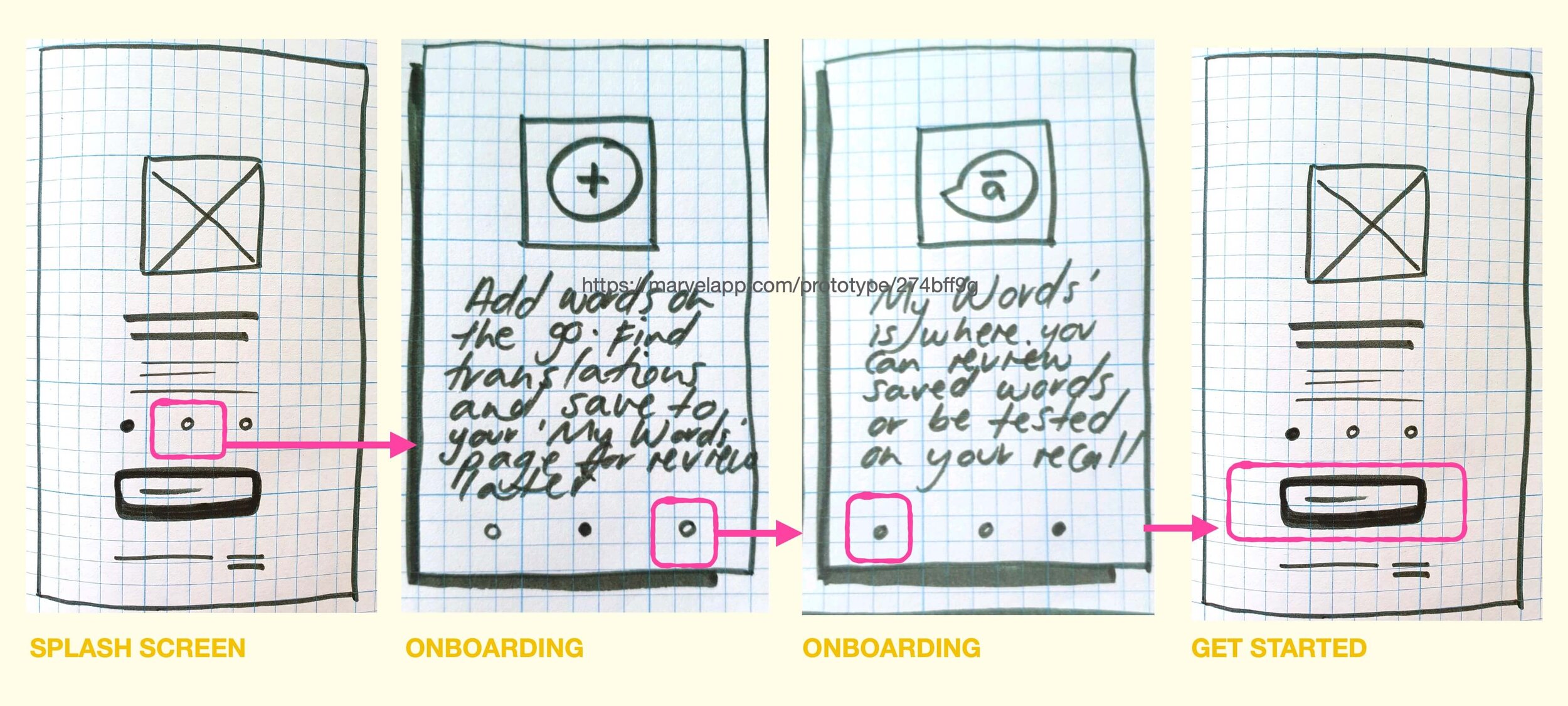
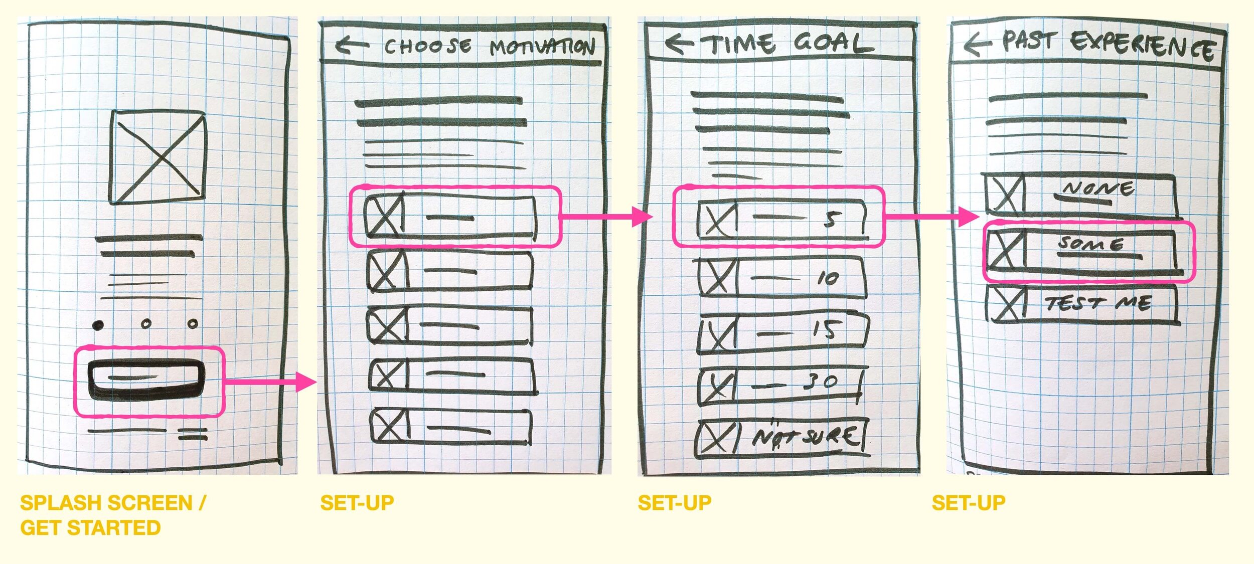
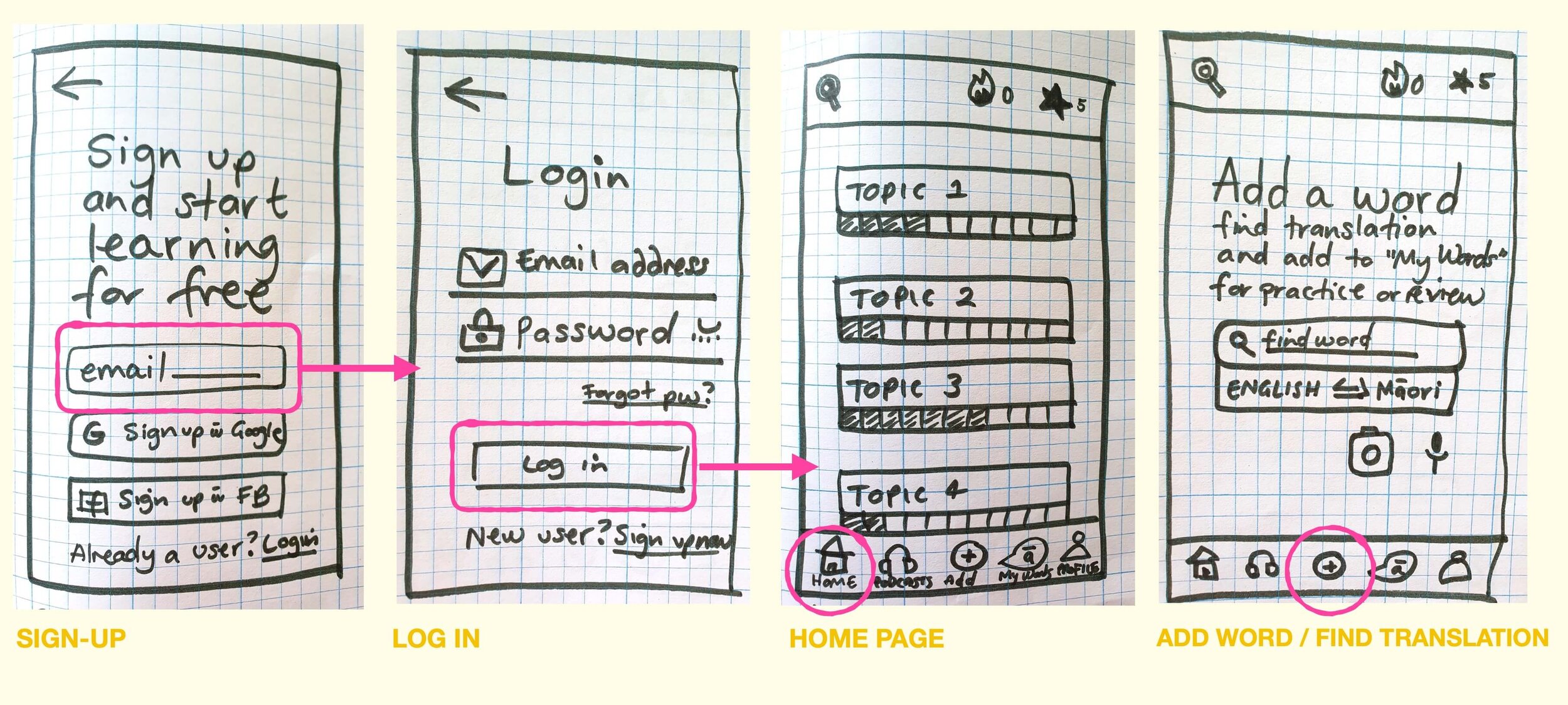
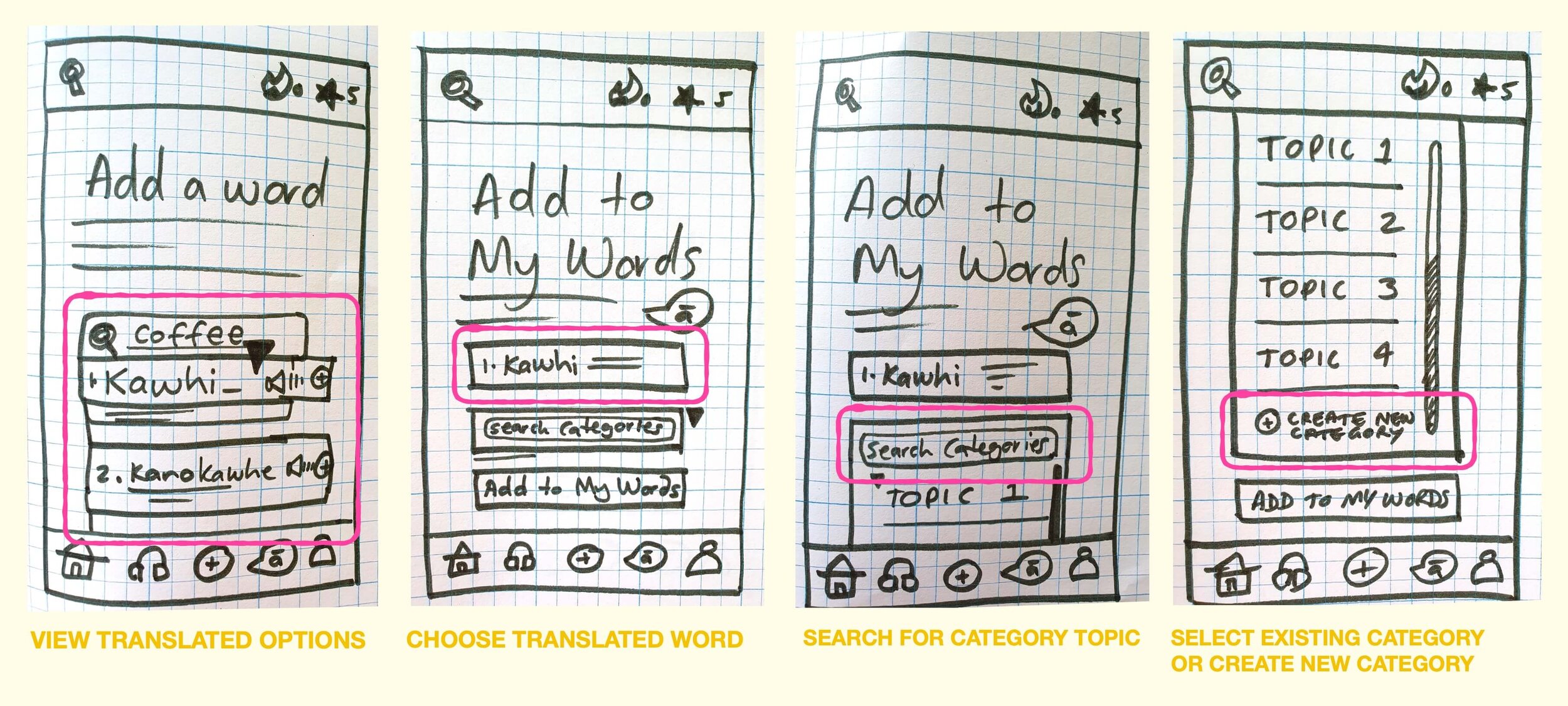
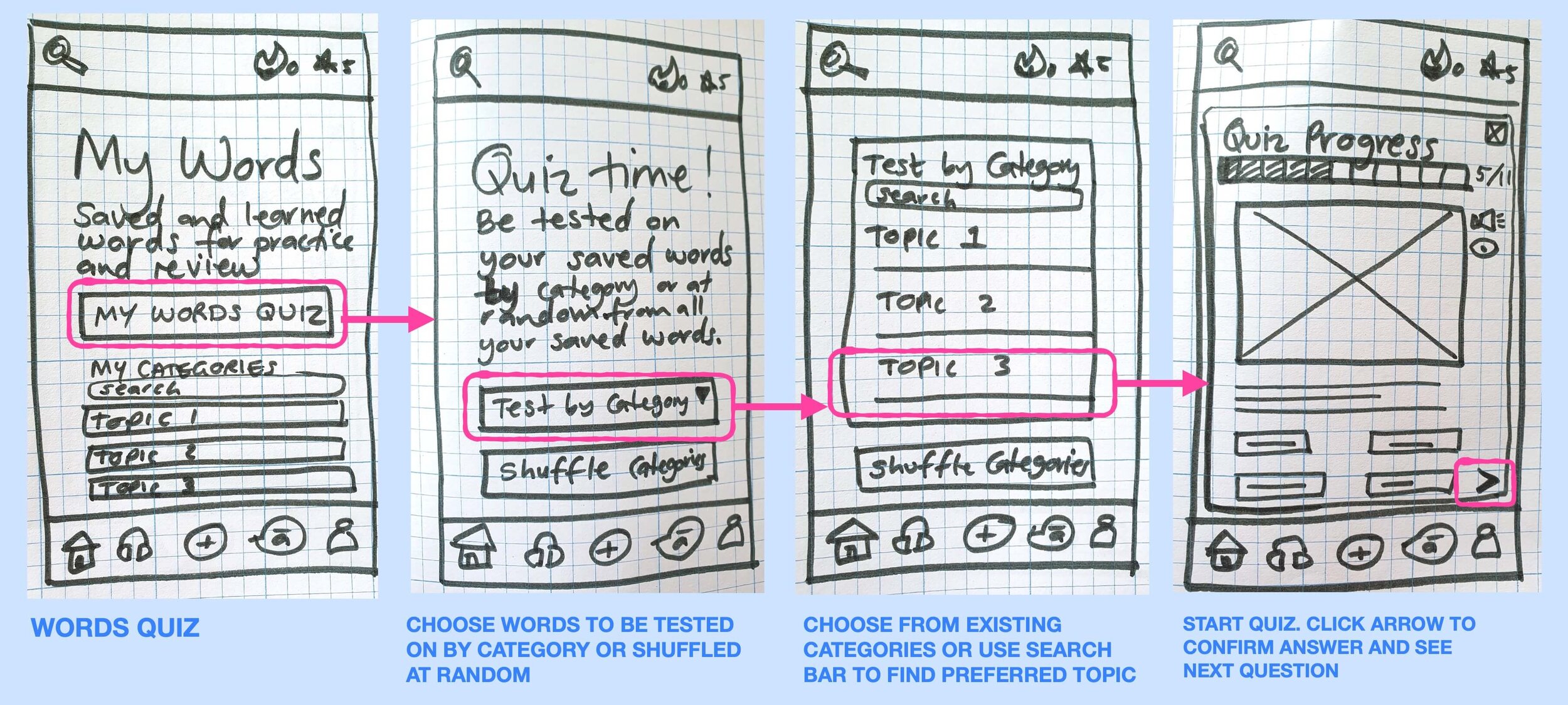
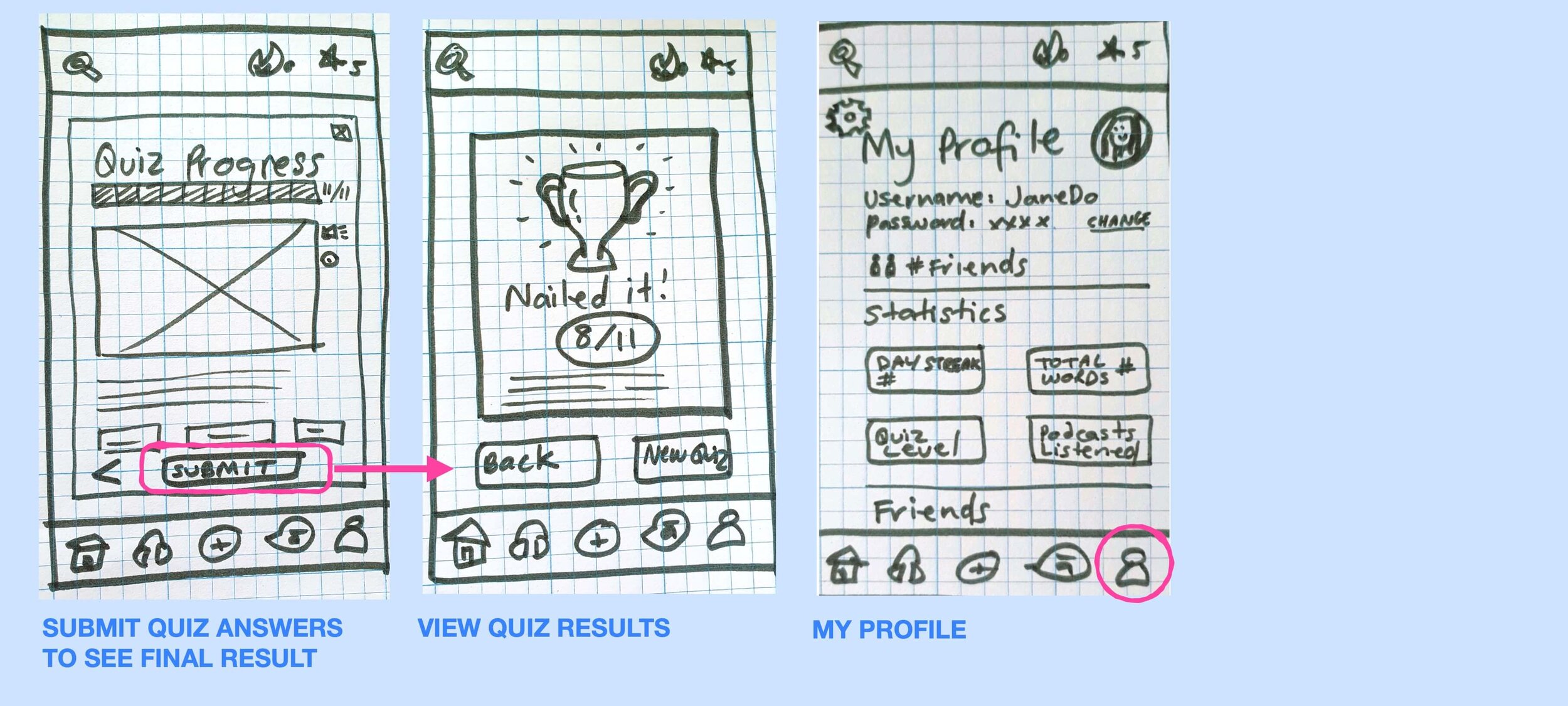
“Complete vocabulary quiz”.
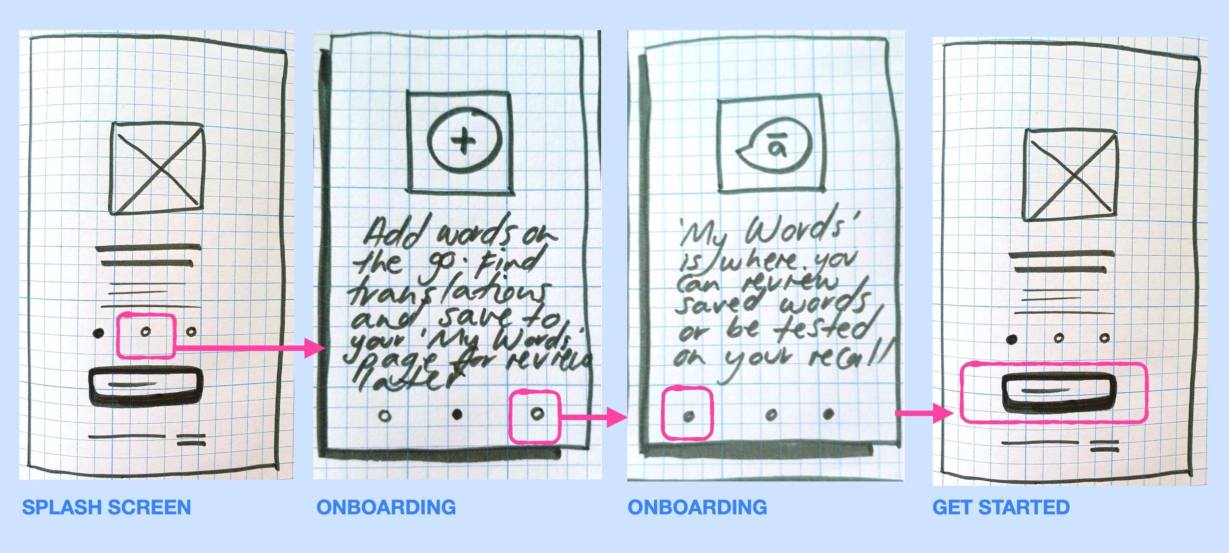
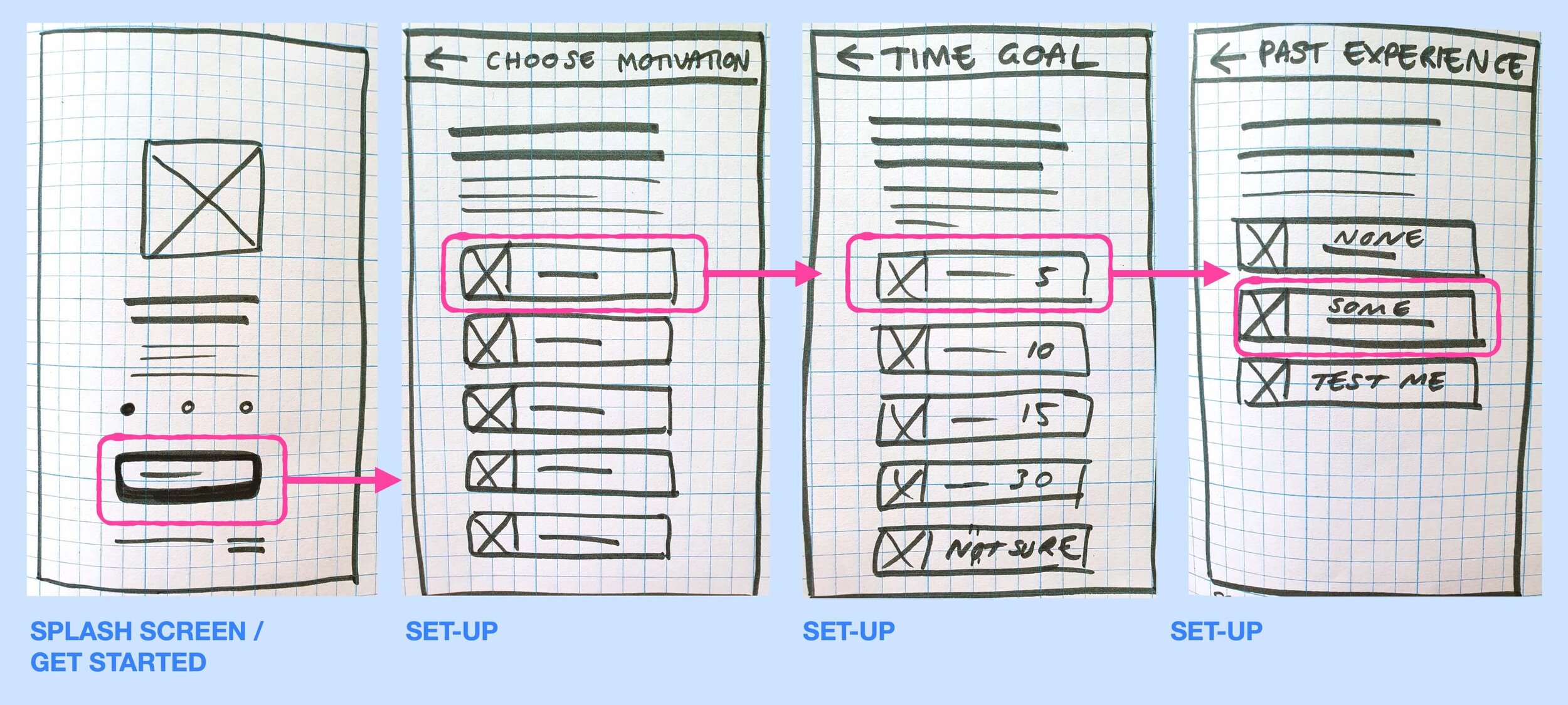
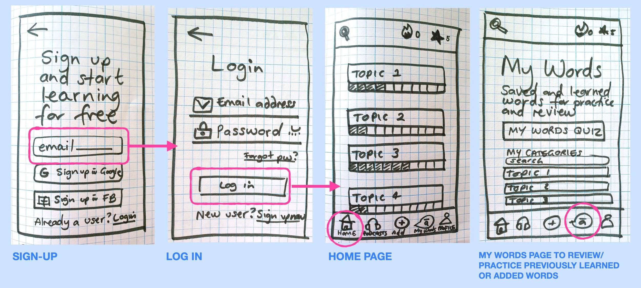
Again, starting at the onboarding screen, these wireframes helped visualise how a user might navigate the app to find a way to be quizzed on words they’d previously learned. I needed to consider where this feature would live, and what elements users would expect and/or need in order to successfully complete a language quiz.
Mid-fidelity
The low-fidelity sketches were the building blocks I needed to translate my screens into Sketch. I added much more detail in the copy, imagery and functionality of the app as I intended to test these screens with users before moving further.
The mid-fidelity wireframes below, focus on onboarding, adding a word, and completing a quiz.
Onboarding.
For each of my User Tasks, I began at the Onboarding process. I felt this was a necessary place to start building mid-fidelity wireframes, as the information both provided to and requested from the user, helps inform the rest of the app. I also wanted to see how this flow felt to users when it came to usability testing.
Add a word.
Next up, I digitised the low-fidelity wireframes for the “add a word” feature. I wanted to explore the different ways users may want to add a word to a personal dictionary. whether that was adding a new word to a brand new category, or adding it to an existing category. I wanted to create enough steps to give users flexibility on how they saved a word, yet not so many that it became a laborious task. I toyed with the idea of typing or speaking the word into the app, in order for it to be captured/translated.
Prototyping & Testing.
Before moving any further, I wanted to test my mid-fidelity wireframes with users - to see if there were any fundamental usability or functionality flaws.
Interactive Prototype.
I created an interactive prototype using Marvel, and then conducted usability testing with a variety of different users. This helped me understand if the flow between screens was working, if I was missing any crucial steps, and if users required any additional features or functionality in order to understand and navigate the Tātākī app.
Usability Test Plan.
Prior to testing, I put together a testing plan to capture the details of what I wanted to test, and how I was going to test it.
I set different direct and scenario tasks for users to complete (all related to my key features). I wanted to make sure the flow not only made sense to users, but that they had everything they needed to complete the task efficiently. See the Usability Test Script here.
Jakob Nielsen’s error severity rating scale (0 - 4) was used to rate/rank the issues flagged in the usability tests.
-
Scope.
Test 4x user flows of the Māori vocab app “tātākī”:
User Flow 1: Complete onboarding process
User Flow 2: Sign up to app
User Flow 3: Add a new word for translation, save in a personalised category
User Flow 4: Review and reinforce my previously learned vocabulary
-
Schedule.
WHAT: In-person testing
WHERE: My home
WHEN: Monday 14 December, 2020
-
Sessions.
WHO: Testing 3 x participants from target user group
LENGTH: 15 minute sessions per person
-
Equipment.
HARDWARE:
Laptop for testing prototype
Pen and paper for taking notes
SOFTWARE:
Marvel (camera/microphone)
-
Scenario Task 1.
Complete onboarding process prior to sign up.
You’ve decided to learn some Māori vocabulary to incorporate into your everyday conversation.
You’ve downloaded the app ‘Tātākī’ and want to see a few features and benefits of the app before signing up.
-
Scenario Task 2.
Set up an account.
You like the look of the app and decide to create an account in order to continue with your learning journey.
-
Scenario Task 3.
Add a new word for translation.
You’re out with friends and want to learn the Māori translation of a commonly used word.
Translate this word and add it to a logical category, so you can easily find it again.
-
Scenario Task 4.
Review your saved words and be tested via a quiz.
Take a look at all the words you’ve saved over the last few weeks, and test your memory of these.
Usability Testing Results.
After conducting in-person usability tests, I analysed the results and identified some urgent fixes that needed to be made (particularly around how to add a new word - which is a key feature of Tātākī) and other “nice-to-haves” if I have time. See testing result details here.
Onboarding.
“At the end of onboarding process slides, it could say something like: “Now that you’ve seen what we offer, click to get started”
Set up an account.
“Will the learning experience be tailored to my answer, or is it collecting data”
Add a new word.
“I would rather learn lessons first, and have the ability to add my own words or phrases as a secondary option”
Test your knowledge.
“I’d like to know if I got the answer right or wrong before I move on to the next question”
Key Findings.
Some users completely skipped the onboarding process
Some users struggled to move on when the prototype itself lacked functionality
Users wanted to be able to translate phrases as well as singular words
Users wanted confirmation on whether they’d got a quiz question correct, immediately after answering (rather than waiting until the end of the quiz to find out)
Some users wanted to understand how their answers/data was going to be used when they were answering questions to set up an account
Some users wanted pop-ups on the Home Screen, to show them what to do (rather than remembering from the onboarding process)
Three main issues arose
from Usability Testing
from Usability Testing
Based on my findings from usability testing, I decided to focus on fixing the 3 main usability issues in my next round of amends. These included:
Adjust the onboarding carousel dots to be easier swipe through
Making the onboarding process more visible to users
Providing feedback to users on quiz results, immediately after answering a question
1 - Onboarding.
Issue.
The swipe-able dots to be onboarded are hit-and-miss. Some users ignored this altogether and went straight to “get started”. The dots were too small and close together, causing frustration.
Solution.
Make the dots bigger and spaced further apart. Include onboarding steps as part of the “Get Started” process, so users get to see these key features before entering app.
Severity Rating 2.
Minor usability problem: fixing this should be given low priority
2 - Add a Word.
Issue.
It confused some users on how to choose their desired translation (some clicked the “add word” icon in the footer).
Solution.
Make the translation results look more obvious for selection (e.g. make the translated words highlighted to denote clickability, and/or put an “add” icon beside each option so users know to add that specific word).
Severity Rating 3.
Major usability problem: important to fix, so should be given high priority.
3 - Quiz Results.
Issue.
Users wanted to get instant feedback on whether or not they got a quiz question right. They didn’t want to have to get through the whole quiz before receiving their result.
Solution.
After each quiz answer, the user’s answer should be highlighted green for “correct” or red for “incorrect” - giving the user instant feedback. “Continue” button is greyed-out of answer is incorrect, so user can retry or view the correct answer.
Severity Rating 2.
Minor usability problem: fixing this should be given low priority.
Next Steps.
I will continue to iterate on my designs of the Tātākī app. Most importantly though, I need to engage with te reo Māori specialists to start building out the lessons and vocabulary content. The designs so far are a good step in defining the problem space, experimenting with layouts and understanding how users like to learn and retain information. Working closely with language and education experts will create an te reo vocabulary tool that will actually be beneficial to users.
Once the content is locked in, I will run additional usability tests on a larger scale (30+ participants if possible).
I’d also like to begin experimenting with UI elements, to bring this app to life and make it feel fun and have a point-of-difference to competitor apps.
