Perfect Properties
Real estate investment is an increasingly popular way for individuals to achieve financial security. It is an exciting and emotional experience, but often complicated.
While there are plenty of blogs and agencies providing information, often, buyers new to the market may struggle to get started without professional guidance and waste time viewing properties out of their range.
The aim of this web app is to provide them with the expertise needed to get started efficiently.
Spoiler Alert
To view the final interactive prototype, click the button below.
Project Duration
2 months
Careerfoundry UI Specialisation
My Role
UI Designer
Tools
Objective
Create UI elements for a responsive web app that provides property buyers with information on properties of interest. Must feel “quick, clean, smart”.
The Brief
Who?
This web app is made primarily for new, small-scale property buyers who are looking to invest for additional income or financial security.
What?
This will be a user-friendly, responsive web app containing a database of available residential properties and land, and comprehensive information on each listing.
When?
Buyers will use this tool when conducting property searches, and making a decision about where to invest.
Where?
Buyers will use this tool at home or on the go. Users can search for properties anywhere, as long as they’re logged in on a device.
Why?
Unseasoned buyers need access to reliable, uncomplicated information about their potential property investments. Buyers get a feel for a place by viewing comprehensive information about the property and its neighbourhood before spending time on-site.
Persona
Meet Rashida. As an IT consultant for a growing tech company, Rashida is frequently on the go, and often holds meetings by phone in her car while driving. She is good at multitasking and relies heavily on technology to help her with this.
Goals
● Rashida makes a good living and wants to invest in property beyond the city for increased financial security for her family.
● She wants to find the right information for fast decision-making.
● She wants a tool to help her find the right properties so as not to waste her time.
Tasks
As she is new to real estate, she wants a tool that is easy to use and that will help her find the property she’s looking for.
● Search for properties, inputting criteria relevant to what she’s looking for
● Easily view and return to listings she’s interested in
● Receive relevant and comprehensive information about properties
Environment
● Physical: Rashida lives with her family in a city on the east coast, and spends most weekends in the countryside.
● Social: She likes hiking with her family, and playing basketball with old colleagues and friends from college. A colleague recently invested in property and suggested Rashida look into it, too.
● Technological: As a computer science graduate, she describes herself as highly competent with technology. She is always on top of the latest trends in tech, and always has the latest model of smartphone. She uses online tools regularly to help schedule her work, social life, and communicate with friends, family, clients, and colleagues. The tools she uses are functional, easy to use, and intuitive.
“I want to provide my family with financial security. I’ve considered buying property for a while, and am looking for a tool to help me find what I’m looking for, quickly!”
User Stories
● As a user, I want to create a profile containing all my property criteria, so that I am recommended results most relevant to me.
● As a user, I want to be able to search and filter properties, so that I can find good matches based on my needs.
● As a user, I want to be able to save or mark properties I am interested in, so that I can easily revisit them.
● As a user, I want to be able to contact the right people if I am interested in viewing a property, so that I schedule a viewing.
Feature Requiremens
● Sign in, create user profile, and input property criteria
● Search and filter available properties
● Bookmark a property listing
● Property recommendations feature
● Ability to contact real estate professional when wanting to move forward with a property
“Finding the perfect property shouldn’t be hard”
User Flows
With my user stories in hand, I started my mapping out some user flows to identify what screens need to be designed in order for my persona to achieve her goals.
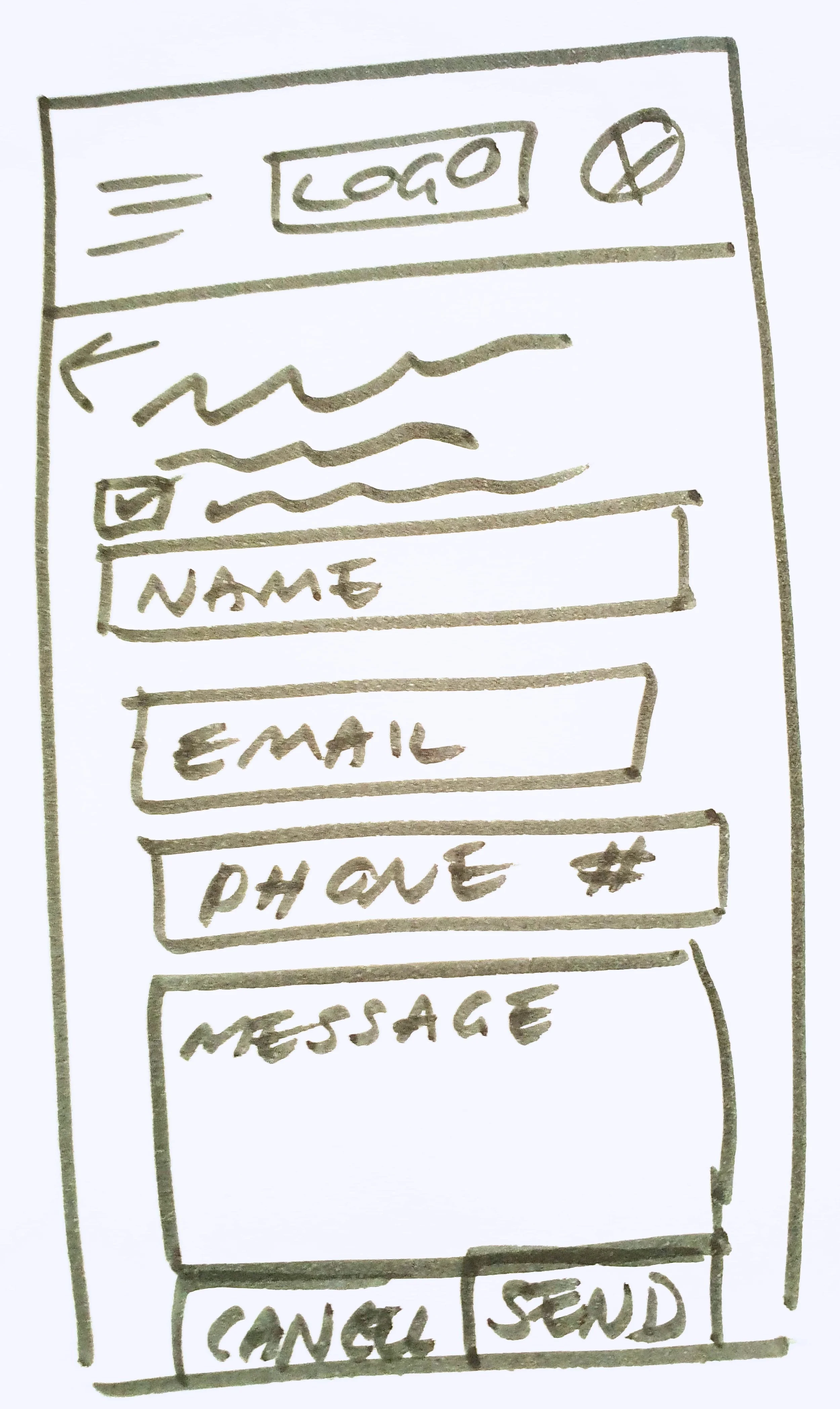
Paper Prototype
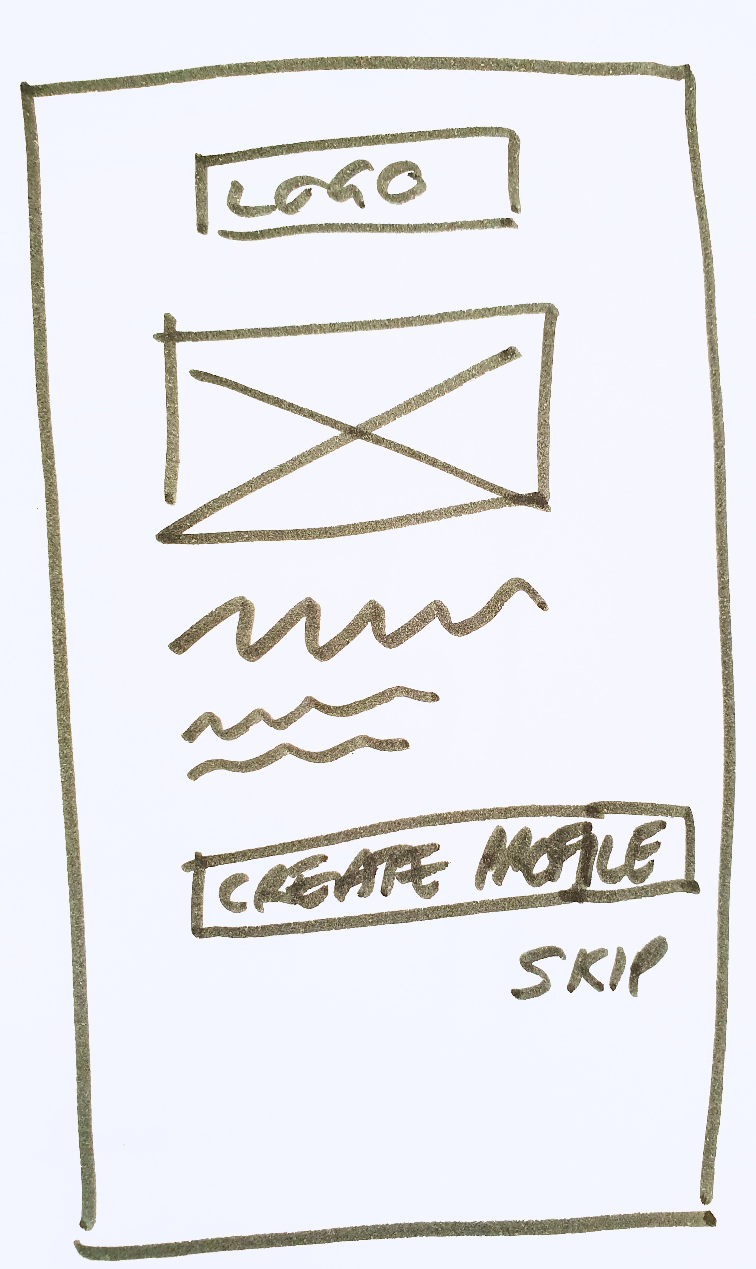
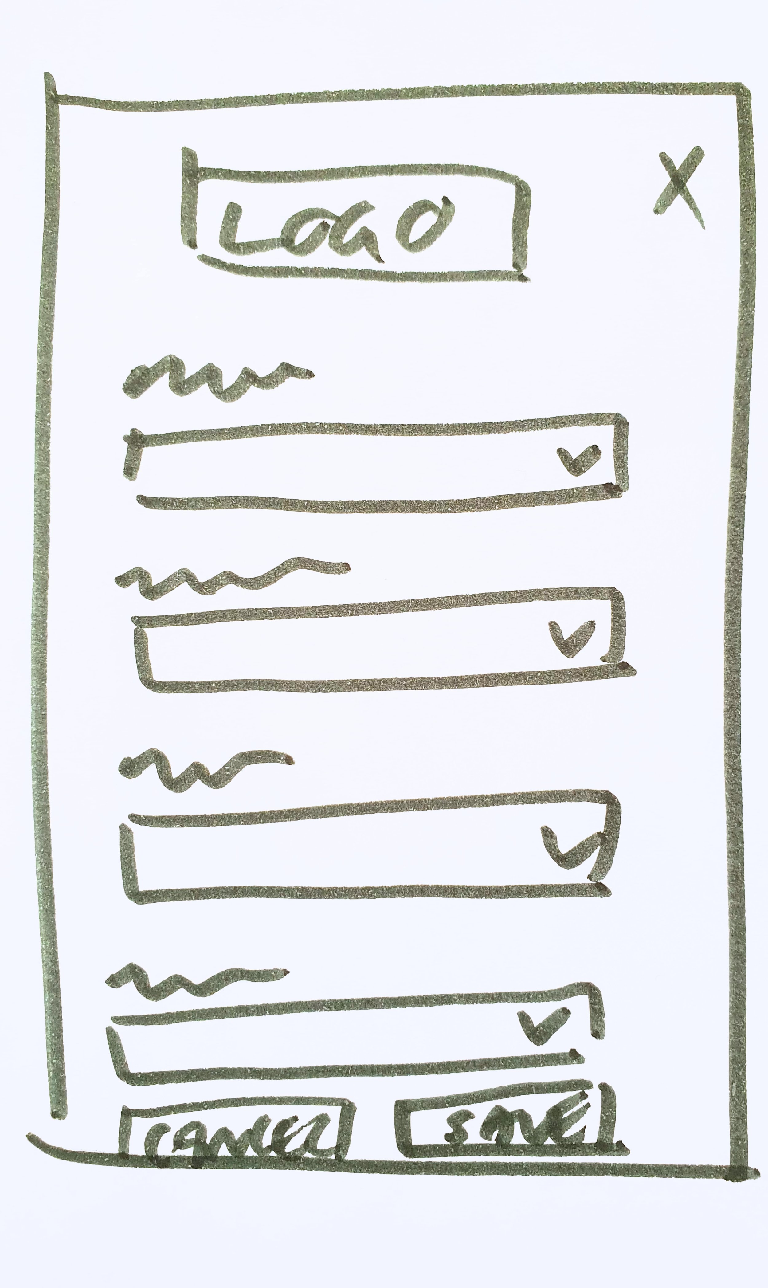
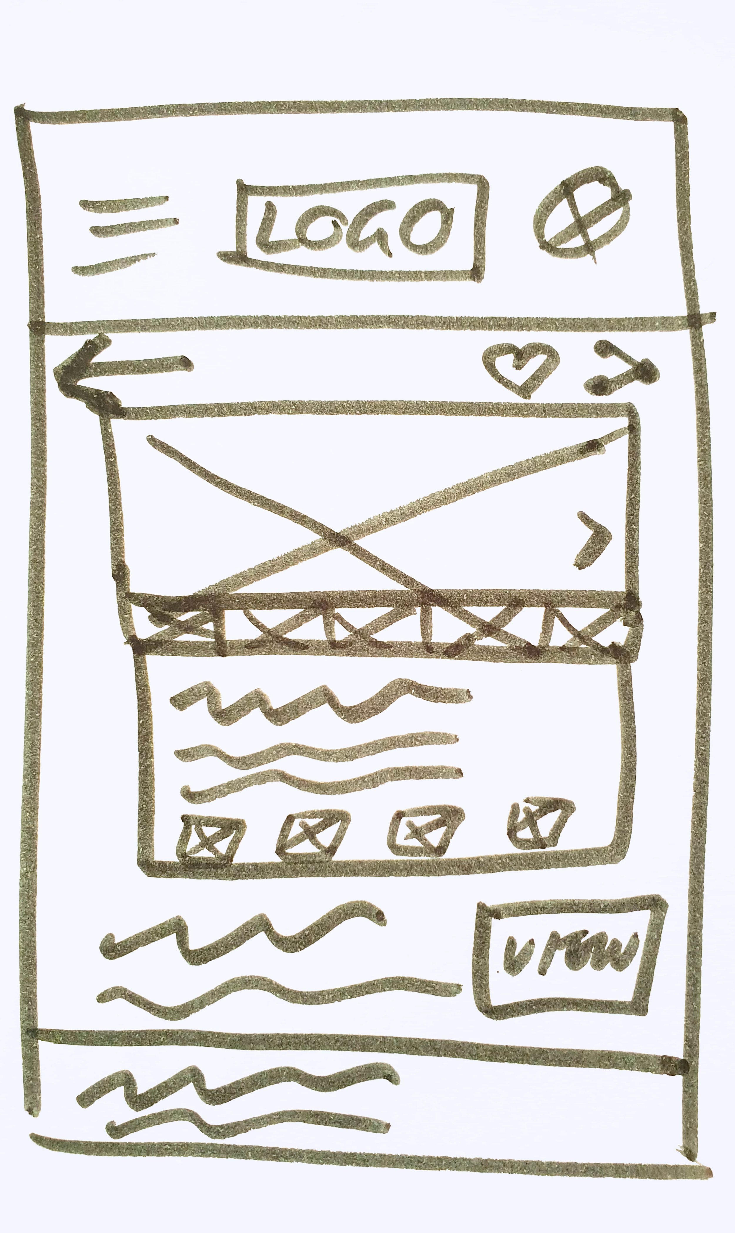
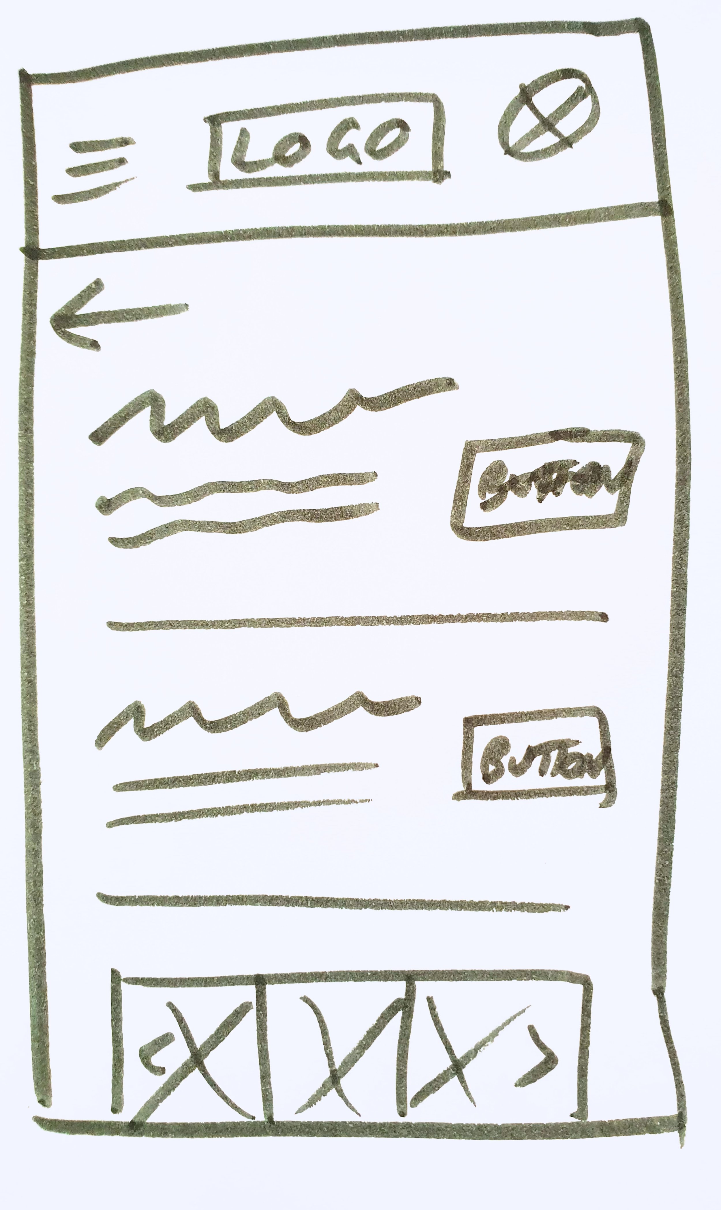
To check if my user flows captured each step and function that my user would need to take in order to achieve their goals, I quickly mocked up paper sketches of my screens in this user flow.
Using Adobe Xd, I created an interactive prototype, which shows how users could move between each screen.
Although extremely low-fidelity, this gave a rough idea of elements required on each screen, the steps needed to get to the next part of the flow, and basic text/image layout ideas.
Some considerations for my paper prototypes:
Navigation style suitable for a web-app (e.g. hamburger menu rather than global navigation of a native app)
Inclusion/positioning of logo or branding on each screen
What elements would users expect when searching for or viewing a property (e.g. image, heading, price, address, property details)
Click the button below to view the low-fidelity prototype.



Mid-fidelity Wireframes
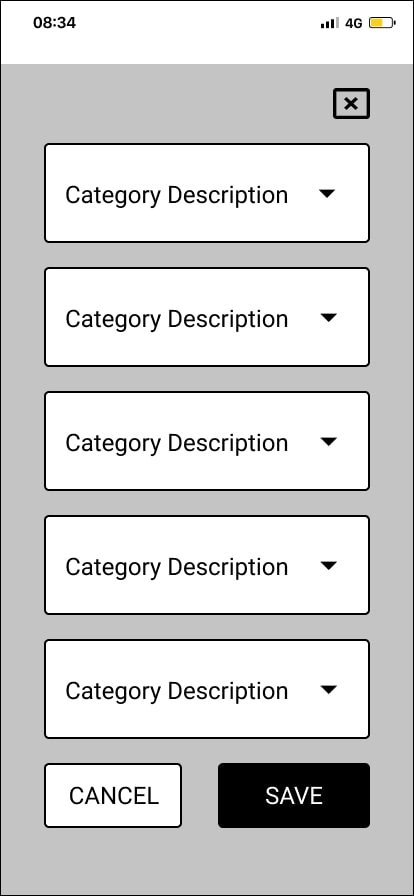
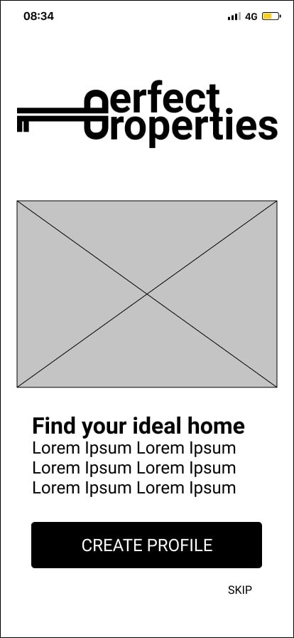
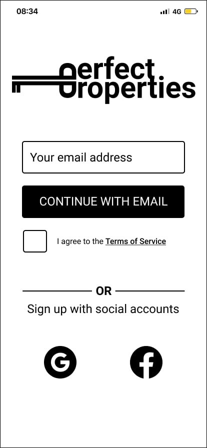
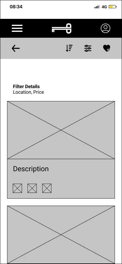
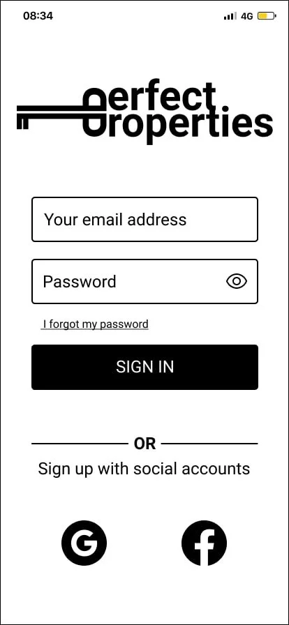
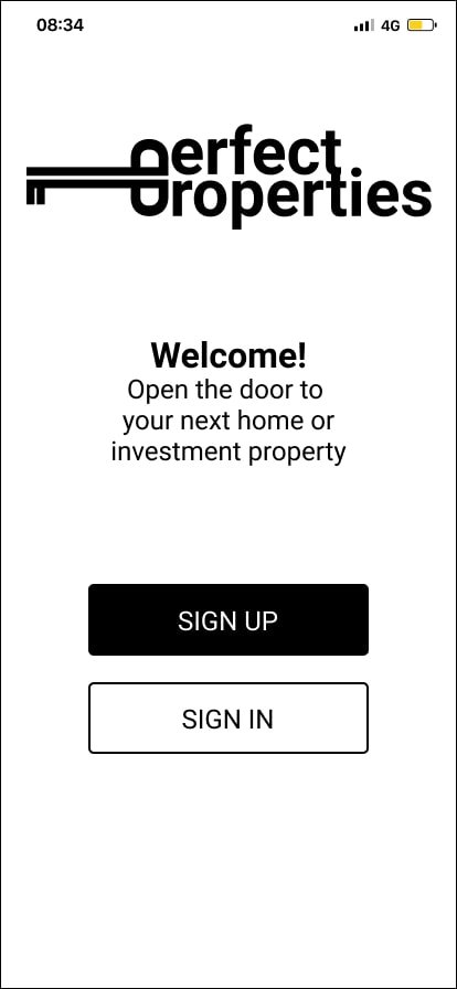
With a basic layout and user flow confirmed, I recreated my designs in Figma to start fleshing out the placement of each UI element. I decided to implement a Fluid grid layout (using a 12-column grid), so content stretches to fit the screen/device, before snapping to the next breakpoint.
Some considerations for my mid-fidelity wireframes:
How might users want to sign up/in (e.g. email vs social logins)
How might users search for properties (e.g. by filtering categories or using a search bar or other function)
How might users save a search criteria
What type of information would a user expect to see on a Home page
What form fields were required for users to complete a task


Moodboards
To bring my designs to life, I experimented with different visual looks and feel through different moodboards. I explored different tones of blue, green and purple to elicit the feeling of professionalism and trust - crucial for a company promoting house sales; arguably the biggest purchase a person will ever make in their life.
I chose to continue with the palette and styling of Moodboard 1 as the bold, saturated, flat colours suit the brief best (“quick, clean and smart”).
Seeing as the target market are younger, new property buyers, Moodboard 2 didn’t feel as dynamic or youthful as Moodboard 1.
The colours and textures of this moodboard are quite arty and aspirational - taking inspiration from nature and Matisse’s “Blue” prints. I imagine renovated period villas, being brought back to life with crisp white paint, bold modern artwork and original wood floorboards.
Moodboard 2 was much cosier with more muted tones. Think moss greens, lavender purples and rustic decor.
Illustration & Animation
Building on my moodboard palette and style, I created a suite of illustrations and animations (reflecting the Matisse-inspired abstract shapes) to be used throughout the Perfect Properties web app. While most of the photography will be user-generated, there’s an opportunity to add branded personality through illustration.
These will be implemented sparingly, but will also inform the iconography that you’ll see later in the Style Guide.
Animation that transitions users from the Sign Up/In screen, to the Home screen.
Style Guide
All colours, typography, illustration, photography and iconography are captured in the style guide. Instructions on when and how to use each asset is included.
Typography
Iconography
Colour Palette
Photography
UI In-Situ
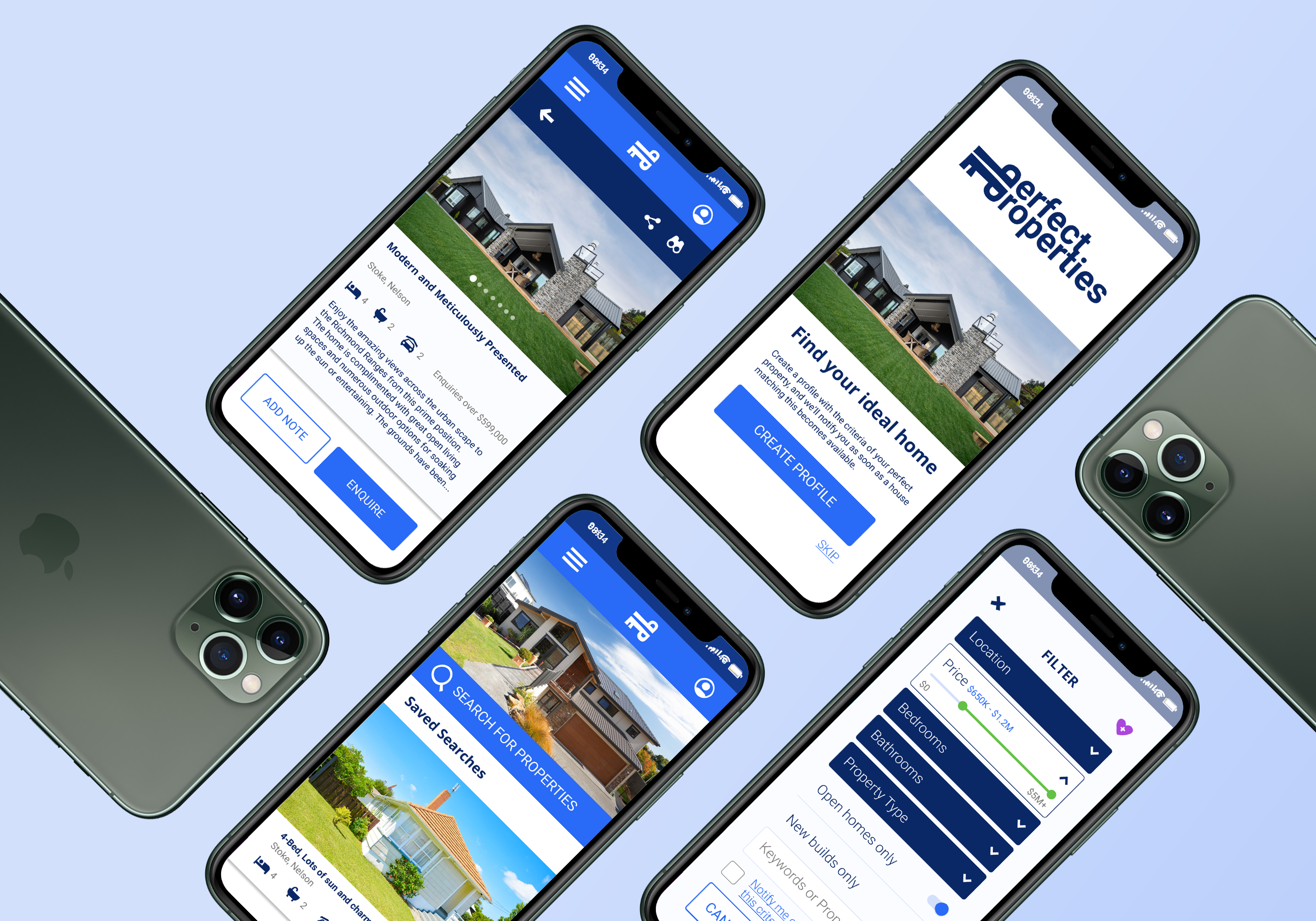
To show how my UI elements would work across the Perfect Property app, I mocked up some high-fidelity wireframes.
Some considerations when developing my UI elements:
What type of menu pattern should I use - how should it transition over the page when clicked.
How should my form fields change as users interact with them - what type of labels need to be included as users type into text fields.
Colour contrast between text and icons on background colours. I ended up adjusting the brand colours so that they adhered to WCAG AA standards.
When creating bespoke icons, what was the minimum size they could be if they weren’t a perfect square, but still look in proportion to other icons.
Starting with a minimum text size for metadata and buttons - how should a typography system be created so that there was enough variation, but not too many styles or sizes to end up looking messy and disjointed.
Click the button below to view this as an interactive prototype.
Responsive Design
Although this app has been designed to be mobile-first, my next step was to apply these designs to different breakpoints to ensure a seamless user experience across other screen sizes.
This is where I finalised spacing of elements and grids. I retained the 12-column fluid grid system across the tablet and desktop layouts - adjusting the margin and gutter spacing as there was more room to breath.
Below are example screen layouts for mobile, tablet and desktop (“small”, “medium”, “large”).
Home
Mobile
Once I started re-designing this page for the different break-points, I realised that I needed to change my original Mobile (“Small”) version. I increased the size of the scrollable images and added more metadata, to make it easier for users to see the house photos and understand the differences between each property at a glance.
Tablet
Adjusted navigation by expanding the menu into text links at the top of the screen. Search icon changed to dropdown fields, so users didn’t need to click through to another page.
Desktop
“Advanced search” feature expanded out from the Medium version, so that all options were available to users. The layout of scrollable properties also changes, showing three per category (and having one hero image, with two smaller images).
Property Details
Mobile
Each breakpoint has one image as the hero, but as the screen size increases, so does the number of preview images for the property.
Tablet
Navigation was adjusted - expanding the “watch list” icon and adding a text description. A text description for the “back” button was also added. Additional navigation is added to the scrollable images for both Medium and Large breakpoints (overlay arrows, and highlighting the currently viewed image).
Desktop
The enquiry buttons become its own section, showing details of the real estate agent (including company name, agent profile photo and buttons for the user to see all contact details, or directly email them). The “watchlist” button expands further, to give a full text description.
Retrospective
Lessons Learned
When laying out responsive designs for larger screen sizes, I needed to go back and adjust the mobile layout to optimise the usability.
The smaller the screen, fewer images should fit across the width of the screen (e.g. one photograph spanning the width of a mobile layout, is easier for users to view than three).
At low-fidelity wireframing stage, allow for more lines of metadata/supporting copy on images and in cards, than you think. It’s easier to remove a line of text than shoe-horn it in further down the track.
Next Steps
Create responsive designs for all other screens in the user flows.
Usability testing. Test the UI prototype with users, to see if it aligns with the brief of “quick, clean, smart” and ensure all the iconography and imagery are clear and easy to understand.
Experiment with other animations and transitions between screens, for added ease of use (and to delight the users).


